Saturday, November 22, 2008

My brother and his boy...


I snapped these shots of my brother, Justin, and his son, Maddox, today...


It makes me feel SO PROUD of my brother when I look at them together.


Hermitage Drive - Master Bedroom


One lonely little pic of the Master Bedroom in our first place...that's all I have to remember it by... :-( sigh...

Tuesday, November 18, 2008

Hermitage Drive - Kitchen & Dining Area

Here are a few pics of the Kitchen...I didn't have to do much after we moved in. I just painted...


...and added beadboard (my cottage style seems to always find its way in...no matter WHAT style the house is!) I painted the phrase, "ENJOY THE LIFE OF YOUR TIME" on the wall in the Dining Area:

I had SO many plans for this house. But, we decided to move because the neighborhood was taking a turn for the worse, and the it needed an entirely new electrical system (which we couldn't afford). All the electrical was inside the walls in this house, because there was no attic. Just a wood-beamed ceiling and the roof directly above that. All the electricians we had come over to check out the situation said we'd need to start tearing down walls to re-wire the house.
It KILLED me to sell the house, but it seemed to just make sense to do it. In addition to the "issues" we were having with it, I was driving 30 minutes to work every day (from Montgomery to Prattville). So, we made the move to Prattville- into the "Lettered Cottage", and it has been great falling in love with this place too.

Speaking of the Lettered Cottage and Kitchens, here's a few shots I took a couple of days ago:


Still very much a work in progress...but my "Little-Kitchen-That-Could" is getting there, slowly but surely... :-)

Monday, November 17, 2008

Living Room Corner

I've been thinking a lot about this area lately...


Here is what is looks like currently:


The problem is, I could never really get the floating shelves to sit right on the wall because the wood paneling is kind of unlevel, and the wall isn't the straightest either. It realllly bugs me.

So this is what I'm thinking:


I would turn the baby grand piano around (I actually just attempted to, and I think I've done something really bad to my back) :-(
I could probably find the piece of furniture at a Flea Market and refinish or repaint it. (Not necessarily brown)
I'd get two lamps to stick on top of it, and hang four 16x20 framed prints on the wall above it.
A rug under the piano, and two of these candleholders (one on each side of the big mirror) would finish out the look.


What do you think? :-)

Layla

PS...YES, that is a Christmas Tree in the left hand corner of the picture...I'll be blogging about holiday decor soon!

PS...The piano is a BABY grand...only about four feet wide and four feet deep. :-)

PS...The candleholders are from Pottery Barn.

Hermitage Drive - Living Room and Art Studio

The disc I was pulling these old pictures from seems to be damaged, so I sifted through about eighty other discs and FINALLY found some more photos to show.

Here are some more photos of the Living Room, right before we moved out.
Please excuse the "tray-table-console" behind the sofa. We used them everyday, but I should have put them away before I shot this picture!!! :)


And without further adieu, this is the ONLY photo of my Studio I had on the disc I found, sorry!


The right side of the room had huge windows all the way across and up to the ceiling. I made the "buffet-style table that you see in the photo by cutting a small wood dining table in half and mounting both pieces side by side to the wall. I attached the striped skirt to the table front using velcro. All the furniture, lighting and accessories are from IKEA.

Tomorrows tour= the Kitchen!

Friday, November 14, 2008

Hermitage Drive - Entry and Living Room


I decided to faux finish the brick wall in the Entry to match the exterior of the house. I used a specially formulated brick-colored paint that had sand mixed in it. I also painted the grout the same color as the grout on the exterior of the house...can you say time consuming? Here's a photo of when I was working on it:


This is the wall opposite the brick wall in the Entry:


Just past the brick wall in the Entry, if you took a right, you were in the Living Room. The 24 foot span of floor-to-ceiling glass windows (that faced South, I might add) is really what sold us on the house. It was always SO bright. Perfect for an artist and musician that wanted to arise and be inspired every day. :-)
This is what it looked like right after we moved in:


The span of windows looked out onto a huge courtyard. It was so beautiful and private.


The ceilings throughout the entire house were cedar, and it smelled INCREDIBLE. We'll never forget that smell.


We ripped the carpet out and repainted shortly after we moved in:


Check out the original floor tiles:


Apparently there used to be some sort of pod-shaped fireplace that hung down from the ceiling here:


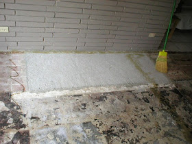
Pictures of Kevin and Jason installing the new flooring:


The room behind the double doors in this photo led to my Studio. I'll feature that tomorrow! I loved how the wall that separated the two rooms didn't go all the way up to the ceiling. The previous owner said there was no wall there at all when they moved in, but they needed the room as another bedroom, so they put up the wall.


This is one Phase the Living Room went through. Keep in mind, this was almost six years ago, and we were broke newlyweds that had to work with what we had. :-)


Then, one day, I had a "bright idea" and decided to repaint and add some trimwork to the "sofa alcove":


It always bothered me that the two sconces in this area were not centered, so I removed them and covered the holes with mirrors. Then I put two "touch lights" on the little shelf I built, and ran the cords down each corner of the alcove.


Eventually I bought a new couch for $300, new curtains from IKEA, and found a carpet remnant at GCO. I had them bind the edges for me to create a custom-sized area rug:


THEN, I repainted the WHOLE room a light beige color, switched out the rug for an IKEA rug, and bought some more furniture:


I also painted the wall in the Entry way a sage green color:


And that's it for this area! If you're curious about my studio space, check back tomorrow. :-)

Layla