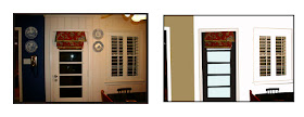
Michelle Rendleman recently purchased one of my Consultations because she wanted my advice on an inexpensive way to pull together a look in her Kitchen.
Currently, there is a battle going on between the color Cobalt Blue and Red in this space.
12 years ago, Michelle bought all cobalt blue accessories, dishes and transferware, but since then, her home has become accented with more red things, than blue.
I suggested choosing one color or the other, but recommended that she choose red since she has become a little disenchanted with the blue things. Michelle agreed that a color palette of red, cream, black and tan was the way to go- and mentioned that in recent years, she's collected lots of plain white dishes.
Here's the design plan I came up with:


As soon as Michelle sends me her "After" photos, I'll be sure to post them here.
She's got big plans for new black granite, or skimstone (concrete) countertops too- can't wait for the big reveal!
Layla

Great job! I love the way you added the black and white pics around the TV.... Awesome,sista! I think I'll try that about mine....I love the simple black counters and door...It will be very inexpensive for her, too! Which is so important right now!Am I first commenter today? YES! :) lol....Meme
ReplyDeleteYou have a great eye! I love the black accents also, and how you "cleaned it up".
ReplyDeleteGreat ideas, I agree with everything but I think I'd leave the red buffet red !!! I think it's a tad too much black ???
ReplyDeleteSue
I always look forward to seeing what you recommend. I have been a designer for 30 years. You are a great young talent.
ReplyDeleteOh, I like all the simple, clean details!
ReplyDeleteI enjoy seeing the ideas that you have for clients. I noticed that in your last post you suggested putting numbers on the stairs. I did this in my home a few years ago. I love it. You can see the post here:
ReplyDeletejoysofhome.blogspot.com/
2008/05/case-of-stairs.html
I do have a question, does it bother your clients that they pay you for the ideas and then you share those same ideas with all of your lucky lurkers for free?
Hi, Layla, I can see how busy you have been, so glad for you. And of course, you are coming up with some great ideas for your clients.
ReplyDeleteHi Joy, thanks for stopping by!
ReplyDeleteMy consultations are a lot more in depth than what you see posted on my blog. They are very personal and specific to each clients space and taste. I post a summarized version of some of the consultations because it's a great way to advertise my services. But, to answer your question, yes, I always get permission from the client before I blog about their consultation. Most people are happy to share their potential new design with everyone, which is truly heart-warming.
Layla
Looks great as always! I love the B&W pixs. Those bring so much personality to a room while also adding a personal touch.
ReplyDeleteI love looking at your room re-do's. They are giving me great ideas!
ReplyDeleteGreat ideas....can't wait to see the after pics!!!!
ReplyDelete~Des
great ideas, i love all the black and white.
ReplyDeleteJust found your blog today, and I love it! Great work on your house!
ReplyDeletelove the simple way in which you changed out to black! beautiful!!
ReplyDeleteThis is fun! I just found your blog. I'm a graphic designer and always do this for myself and friends. Great idea to make it a service online. I wish I had the time, I love doing this type of stuff. Good luck with your company:-)
ReplyDelete