Hello Friend- and welcome to "Screened Inn"...
the magazine!
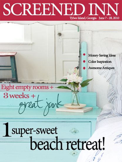
I'm kidding.
It's not actually a real-deal-completely-finished magazine.
We just started to throw it together yesterday, for fun.

But we have been working on a real, extra fancy-schmancy e-zine that we do hope to finish and release very soon!
It'll be free of charge to all those who want to read it, and we'd like to release a new one each season. It'll include interviews, tutorials, and of course, house tours and decorating ideas galore!
More details about that coming soon, but for now, you can check out our Screened Inn project by clicking on the flipbook below.
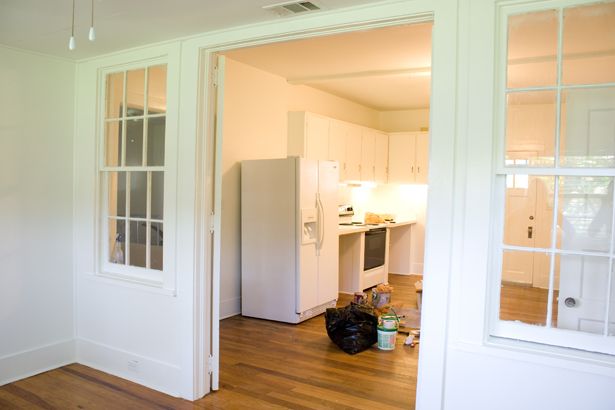
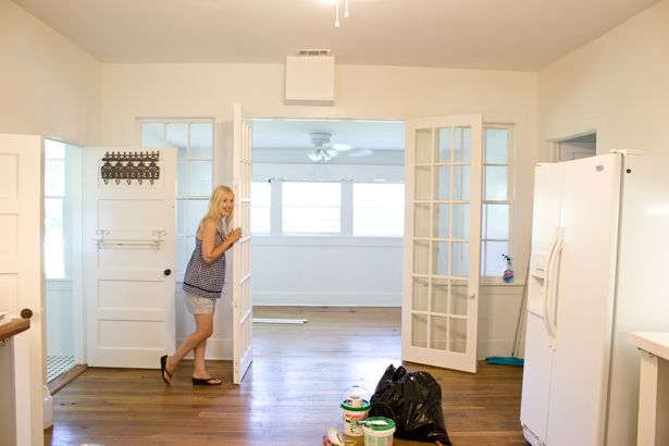
But, real quick, here's a look at what the kitchen looked like when we got there earlier last month...

Once the magazine is open, you can turn the pages by clicking on the little curled up page corner located at the bottom right of each page.
Click to launch the full sized magazine
Hope you enjoyed the tour of the kitchen, bathrooms, and master bed & bathroom!
We had so much fun working on them.
Stay tuned for photos of the "Lemonade Mermaid" bedroom, the "Sand & Sea" bedroom, and the dining/living room later this week!

In other news, we finally started a "The Lettered Cottage" Facebook page!
If you'd like to stop by for a visit, click on the banner below...

or you can find a link to it in our sidebar too.
Ooh!
That reminds me, if you're looking for our blog button, wanna sign up via email, wanna subscribe using a reader, or just wanna follow our blog-
you can find all those things in our sidebar too...

Happy 6th of July!

This post brought to you by...

-------------------------------------------------------------------------------------
PS-
The winner of the Stella and Dot jewelry giveaway is...
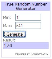
Michelle from
Vintage Junky
Congratulations Michelle!
Drop me a line at LaylaPalmer@aol.com and I'll put you in touch with Jennifer.
-------------------------------------------------------------------------------------
Need help arranging your furniture?
Need design help?
Check out my e-book!

the magazine!

I'm kidding.
It's not actually a real-deal-completely-finished magazine.
We just started to throw it together yesterday, for fun.

But we have been working on a real, extra fancy-schmancy e-zine that we do hope to finish and release very soon!
It'll be free of charge to all those who want to read it, and we'd like to release a new one each season. It'll include interviews, tutorials, and of course, house tours and decorating ideas galore!
More details about that coming soon, but for now, you can check out our Screened Inn project by clicking on the flipbook below.
But, real quick, here's a look at what the kitchen looked like when we got there earlier last month...


Once the magazine is open, you can turn the pages by clicking on the little curled up page corner located at the bottom right of each page.
Click to launch the full sized magazine
Hope you enjoyed the tour of the kitchen, bathrooms, and master bed & bathroom!
We had so much fun working on them.
Stay tuned for photos of the "Lemonade Mermaid" bedroom, the "Sand & Sea" bedroom, and the dining/living room later this week!

In other news, we finally started a "The Lettered Cottage" Facebook page!
If you'd like to stop by for a visit, click on the banner below...

or you can find a link to it in our sidebar too.
Ooh!
That reminds me, if you're looking for our blog button, wanna sign up via email, wanna subscribe using a reader, or just wanna follow our blog-
you can find all those things in our sidebar too...

Happy 6th of July!

This post brought to you by...

-------------------------------------------------------------------------------------
PS-
The winner of the Stella and Dot jewelry giveaway is...

Michelle from
Vintage Junky
Congratulations Michelle!
Drop me a line at LaylaPalmer@aol.com and I'll put you in touch with Jennifer.
-------------------------------------------------------------------------------------
Need help arranging your furniture?
Need design help?
Check out my e-book!


Love it! The magazine is so much fun to flip through. The ideas in there are inspired. The cottage looks so pretty and welcoming.
ReplyDeleteThanks for sharing your talent with us. I only hope I'm able to put some of the inspiration I get from you to appropriate use. :)
get out! A-MAZ-ING! I swear you will be on the news stands (the real live news stands!) before you know it! -denise
ReplyDeleteI love Screened Inn, you did a fantastic job and got so many ideas from it! This couldn't have come at a better time for me as I'm changing my decor to beachy cottage!
ReplyDeleteThanks again,
Rondell
I have Screened Inn ~ e-zine love, wonderful and inspiring. You two have amazing vision!!
ReplyDeleteIts all good!
ReplyDeleteYou are so up on all things technical, et al. I am so behind!
Layla,
ReplyDeleteI absolutely adore the fabric that you used on the kitchen table as a runner! Did you purchase it online? If so, could you send me the link?
Thanks!
Layla! You did such a great job with the e-zine! I love it!
ReplyDeleteOh my gosh, I love your "magazine"! I am savoring every page. More please.
ReplyDeleteLayla, what a cool idea about the e-zine! The rooms look gorgeous! Everything looks so fresh and inviting! Can't wait to see the other rooms!
ReplyDeleteWow guys...amazing job on the ezine. I actually enjoyed reading it more than some real magazines out there!!! Nice. ~Stacey
ReplyDeleteMORE please! LOVED The Screened Inn "magazine"!!!
ReplyDeleteLayla, it all turned out so beautiful. I love every room and couldn't pick a favorite. My only complaint is that I wish I could see more of that bedroom with the twin beds. GORGEOUS colors. Love the door turned headboard, the kitchen light, the stool in the kitchen, I could go on and on. Great job and kudos to Diane for having found some great things to work with.
ReplyDeletewow, what a GREAT way to showcase the cottage... How did you create it that way?????? Can't wait to see your ezine....
ReplyDeleteI have been waiting for more glimpses of the Screened Inn. Love your style. Love your site. The ezine is good but my favorite is the presto-changeo photos on your blog. You and Kevin are an inspiration. I am enjoying watching your ventures grow and blossom.
ReplyDeleteThanks! Loved the e-magazine and love your e-bopk I read over just two cups of coffee! Trying to fix up my *sorta scary* recently purchased house, to make it as lovely as yours! Thanks for the great ideas!
ReplyDeletelove the Screened Inn e-zine! Great idea. Can't wait to show James when he gets back.
ReplyDeleteOH MY GAWD!!!!!!!!!!!!!!
ReplyDeleteLayla and Kevin, you out did yourselves this time.
I am going to have save ,save ,save and visit this cottage of pure restful, beach vibe very soon.
I love the colors, the mixing of blue that you do so naturally, and all the Layla touches.
I am off shopping (actually junking) for some fun red splashes to throw somewhere in my farmhouse with an identity crisis, beach house.
You always inspire me.
You have taught so many to do what they love, live how they love and always follow a dream.
Love Facebook too.
Cheers to you!!
Just beautiful. geri.
What a beautiful book you have put together and a fantastic job on that cottage! Love it and can't wait to see more!
ReplyDeleteSo impressed with your ezine! Screened Inn is fabulous! Great job!
ReplyDeleteHey Layla!
ReplyDeleteYour design job at tybee must have been a HUGE hit, TJ and I tried to book a cottage and they're all booked up for JULY!! We are going to Folly Beach, SC instead. :( I was SO looking forward to trying to stay in one of the cottages. Oh well, maybe next year. :) I love everything you guys did to the Screened Inn....very sweet! :)
Hope you have a great week and please pray it doesn't rain on us while we're gone! :)
Hugs
Melissa
GOOD MORNING LAYLA I CAN NOT TELL YOU HOW MUCH I ENJOYED LOOKING AT "SCREENED INN " MAGAZINE I WOULD BUY IT EVERY ISSUE !!!!!!!!
ReplyDeleteWILL LOOK FORWARD TO SEEING MORE :)
THANK YOU SO MUCH FOR SHARING !!
WARMLY
JANET
I loved it! What an ingenious way to showcase what you have done! Very professional and informative!~Hugs, Patti
ReplyDeleteOMG!!!!! LOVE, LOVE, LOVE your e-zine!!!!!!!!!!!!!! You two are amazing!
ReplyDeleteKeep up the GREAT work!!!
Kaye
LOVE IT! Can't wait to see the rest of the retreat treats.
ReplyDeleteThe two of you did an amazing job!!!! I am so impressed with the uniqeness and cohesiveness! Congrats on your experience!
ReplyDeleteThe two of you did an amazing job!!!! I am so impressed with the uniqeness and cohesiveness! Congrats on your experience!
ReplyDeleteYay facebook! I've liked you and added you to my page's favorites
ReplyDeletehttp://www.facebook.com/DecorAdventures
OHHHH MY, was that a FABULOUS FABULOUS TREAT! You two continually AMAZE me with the ideas that must oooze out of your pores! (that sounds kinda gross, but I meant it in a good way!) I CAN'T WAIT for this seasonal e-zine you are talking about. You both deserve every good thing that comes your way.
ReplyDeletefabulous Layla!
ReplyDeleteThe home looks beautiful! Great job!! Thanks for sharing the magazine you guys made.
ReplyDeletexo,
Kelly
SQUEEEEEEEEEE! You are fantastic!
ReplyDeleteAbsolutely lovely. Nothing I don't like. Even the cute way of holding the TO. Great job.
ReplyDeletethe Sreened Inn is so great! thanks to you and your lovely designs.. i am loving everything about it.. you are amazing.
ReplyDeleteI think the master bedroom is still my favorite :)
ReplyDeleteAmazing job with the e-zine, ps. You'll be in print in no time, I'm sure!
Great e-zine! What fun! The rooms look beautiful. One correction, I'm pretty sure the color "stolen kiss" is a Sherwin Williams color, not BM, unless they both have the same name for that red.
ReplyDeletePS - if anyone wants to vote on this on kirtsy, I added it over there - my user name is JacquiBFD.
ReplyDeleteYou did a beautiful job! Thanks for posting in such a creative way.
ReplyDeleteI'm so stunned on this cool online magazine idea, I just finished pouring my coffee into a small water glass. :P
ReplyDeleteThat magazine was the coolest thing ever! It's so nice to view the decor in a larger format. I had no idea this kind of thing was available.
The pops of colour everywhere in your decor was so 'cottage fun!' And that light was to die for. I've been wanting to attempt something similar forever in my kitchen with pipes. You've just proven it CAN be done. Awesome. :)
Thanks for the fun tour, Layla and Kevin! You guys really outdid yourselves.
Always amazed, Donna
HOly Cow how fun...get wait to see your e-zine!
ReplyDeleteYou guys are my go to spot for inspiration!
Happy Day
You are so talented! The ezine was incredible! Enjoyed it so much this morning! Thanks! :)
ReplyDeletelove it! And thanks so much for the giveaway win! I am super duper excited!!!!
ReplyDeletexoxo
You did an amazing job on not just the decorating, but also in your cool presentation through the e-zine! LOVE IT! I had a question about the red cabinet with the dark stain showing. Could you explain how you did that to achieve that final look? Luv it! Thanks for always helping with my decorating "fix" for the day! lol
ReplyDeleteHow beautifully done!!
ReplyDeleteLove the kitchen. So bright and bold, yet inviting. All the rooms look great that you showcased in the ezine. You and Kevin did a great job.
Layla and Kevin -
ReplyDeleteLove the magazine format used in sharing your latest piece of art! The Screened Inn looks amazing and I love the contrasting, unpredictable pops of color you used throughout.
Your Friend,
Deborah
Loved the Screened Inn e-zine. Very clever. I want a bedroom just like yours. So peaceful. I love the quote you put on the wall. The kitchen is amazing too.
ReplyDeleteThanks for all your inspiring ideas.
Lisa
Every bit of it is amazing, you two make a wonderful team!!!!!!
ReplyDeleteXO
Kristin
Layla, you have outdone yourselves! Every little detail is absolutely amazing! I don't know whether to comment more on the creative magazine spread or the actual designs. They were both so fabulous! Great job!
ReplyDeleteYou guys never cease to amaze me. What a beautiful little magazine you put together! Love it.
ReplyDeleteMartha Stewart eat your heart out! That is GORGEOUS! I do believe I would never want to leave that cottage!
ReplyDeleteWould you mind sharing the white you used on trim and walls? White is so darn tricky! Did you use the same in each room?
I'm INN-LOVE! Your magazine was soo much fun to look at. I read it 3 times. What darling rooms. I'd love to stay there. Oh and I'm a Facebook Fan!
ReplyDeleteLove your "magazine." I've been wanting to scrapbook our 100 year old farmhouse renovation, and I think that is how I should do it!!!
ReplyDeleteYippie!!!! I had so much fun looking at all the wonderful work you guys did....LOVE IT! Great job on the photos and photo styling...You guys ROCK!! Cant wait to see more...Very inspiring!
ReplyDeleteAs always, very inspiring and creative! Your blog is always a great read.
ReplyDeleteI apologize for calling you a tease. That was well worth the wait! Lovely, really lovely!
ReplyDeleteLove Love Love the magazine! I think you should do more!!! Beautiful photography, quotes, and designs - creative ideas and diy tips!
ReplyDeleteThanks for sharing!! The cottage looks great!
Hi Layla and Kevin-
ReplyDeleteIt makes me smile when I see the great talent you two have- you are so talented in every aspect of the word. Your e-zine is just perfect. You have such "vision, style, and purpose." I think it is going to take you far in the design world.
Looking forward to reading and seeing more.
My best-
Diane
I just love the e-zine and those photos are beautiful. Especially love the red enamal topped cabinet. I can't wait to see the yellow bedroom.
ReplyDeleteYour talent is incredible. And I love that gave us a peek through a "magazine"...so fun & again, more talent from you! I love every single bit of the Screened Inn! Thanks for inspiring me in so many ways.
ReplyDeleteLove the e-zine and all of your hard work!
ReplyDeleteYou guys totally inspire me!
Your biggest fan,
Laura
How fun!
ReplyDelete*Love* the red and white stripes in the kitchen and totally digging the pendant light fixture.
Just fanastic! And what a unique way to showcase your work. I loved the magazine! You are both very talented. I saved it to savor later and share with friends.
ReplyDeleteI will relish the day when I can say.."I know Layla Palmer" ---and I have the bathroom and bedroom to prove it. :)
ReplyDeleteCheers~
e
Wow - you are so tech savvy! If you're trying to land a job in the magazine biz, I think you're on your way. You do it all, the designing, photography, page layouts, writing... they wouldn't even know where to have you focus!
ReplyDeleteLove the cottage! In the one kitchen photo you can see into the master bedroom and the desk has polka dot stuff (blue and red)folded and put in the side of it. Is that a blanket or towels and where did you get it?
~Heather
Oh my goodness love the Screened Inn e-zine! I feel that I should pay you . You & Kevin are so talented !!!
ReplyDeleteLoved the cottage style and the "magazine". The look is comfy, cozy, and warm....just like you.
ReplyDeleteI enjoyed the e-zine so much!!...best I've ever seen!
ReplyDeleteLove the magazine, Kevin & Layla. I'm digging all the cottage elements you've incorporated into this project. I am really enjoying your use of color!
ReplyDeleteAmy
Your magazine is wonderful. I enjoyed looking through it at the gorgeous images from The Screened Inn. You did an amazing job. It is my dream to stay there one day.
ReplyDeleteBest Wishes from England.
Lindsay
I love your magazine. What beautiful ideas for anyone who wants a touch of the ocean in their home.
ReplyDeleteBlessings,
Marcia
The magazine is great! What a fun and quick read. Thanks for sharing!
ReplyDeletelove the e-mag - i will HAVE to sent the link to all of my friends...can't wait for more! you guys are doing an excellent job with this "mess hall"...
ReplyDeleteWOW. That was *great*! Thank you for putting that together! Such great ideas. My favorite? The towels in the window box!
ReplyDeleteGREAT job on the magazine!!!
awesome! it's such a happy house! going right now to befriend you on facebook... :)
ReplyDeleteWOW...looks beautiful and I love the e-zine - so eco-friendly!! Thanks so much for sharing and inspiring all of us to be more creative with our spaces.
ReplyDeleteIt is all absolutely charming and pretty, so clean and fresh. How could life not be absolutely wonderful in such a space. You are so talented in so many ways! The photography looks absolutely professional!
ReplyDeleteHey Kevin and Layla!
ReplyDeleteY'all are so, so talented! It is such a gift! I'm so impressed with the e-zine and the lovely pictures, captions and of course, with the beautiful cottage.
Fantastic job!
Just looking at the pictures makes me want to pour a glass of fresh-squeezed lemonade and pretend I'm at the beach! What a great place, and even though I am jealous that I didn't win the name contest, I love the name "Screened Inn!"
ReplyDeleteFabulous! I adored everything that you did. It was simply charming.
ReplyDeleteYou are amazing girl! And I have to agree your magazine would be wonderful.
Alright, it's on the front page of kirtsy now!
ReplyDeleteSigh. Can I have your life? Or at least your creativity, drive, ideas and energy?!
ReplyDeleteNo? Alright, well... thank you at least for sharing all this loveliness, so I can live vicariously through you. :)
That cottage turned out so darling! I could move right in. I love the combo of turquoise, aqua and red.
ReplyDeleteLayla..I love your style, I have been reading your blog for months now & noticed a few months back that you had visited Tybee.. I loved that considering we had planned our honeymoon there. Long story short.. We spent the week of June 28th -July 3rd on the North Shore. I am absolutly mesmerized by it and have been obsessed with finding my own little cottage down there now.. Anyhoo, small world! You did a great job, capturing Tybee, and a little Savannah.
ReplyDeleteWOW. Loved the magazine. I've looked @ it three times already. I really like the light. Also, I think the twine holding the toilet paper is fun! I love the color scheme overall. And wow your magazine really looks like the real deal!
ReplyDeleteI am so impressed by you two! Your work is awesome, and what I love most is that you work on these projects together!
ReplyDeleteGood. Stinking. Grief! You are amazing, Layla and Kevin!! How do you find extra hours in the day that the rest of us don't know exist? I mean, I'm an industrious person who doesn't waste tons of time, but I can't imagine getting done everything that you two do... And you do it so _well!_ Thanks for sharing your gifts with us!
ReplyDeleteLove the e-zine; can't wait for more! I also now want to go back to Tybee Island even more than I did before. Cottage looks amazing.
ReplyDelete