
Here is what is looks like currently:

The problem is, I could never really get the floating shelves to sit right on the wall because the wood paneling is kind of unlevel, and the wall isn't the straightest either. It realllly bugs me.
So this is what I'm thinking:

I would turn the baby grand piano around (I actually just attempted to, and I think I've done something really bad to my back) :-(
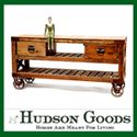
I could probably find the piece of furniture at a Flea Market and refinish or repaint it. (Not necessarily brown)
I'd get two lamps to stick on top of it, and hang four 16x20 framed prints on the wall above it.
A rug under the piano, and two of these candleholders (one on each side of the big mirror) would finish out the look.

What do you think? :-)
Layla
PS...YES, that is a Christmas Tree in the left hand corner of the picture...I'll be blogging about holiday decor soon!
PS...The piano is a BABY grand...only about four feet wide and four feet deep. :-)
PS...The candleholders are from Pottery Barn.
















19 comments:
It's a great idea and it is YOUR space. I don't like it because it makes that corner look very heavy. I like the way it is currently. It helps make your living room feel bright and airy. Just my opinion.
I think it's a great idea. A piece like that would also give you some storage. I never have enough of that. The room looks more complete with the changes. Do it!!!
I agree with mama2one...I would want the breath and life of open space all around that beautiful (big) piano.
it looks nice,but concerned it may look too heavy.
I love the idea -- maybe a smaller console table if it feels heavy?
But my real question, where in the world are those candle holders from?? LOVE.
I don't think it would be too heavy, especially if you found a console that was open with a shelf on the bottom...I'm dying to see how you decorate your Christmas tree!
I like what you currently have. I think too much furniture going on in that area of the room with the piano already being so big. I love it like it is, but it is your home and you have to do what you like and what won't bug you.
You could stick a toilet there, and I'd be in love with it. I have been eying those candle (are they considered sconces?) for a while. I've been walking around my house trying to figure out exactly where I would put them. They're gorgeous!
Love it!
I am looking forward to your christmas decorations~ surely there is a centerpiece in there somewhere!!
I just read comments. Huh. Too heavy they say? I guess if it's too much bulk over there, you could try some "lighter" tables like
http://www.potterybarn.com/products/p7275/index.cfm?pkey=cconsole%2Dtables
or
http://www.potterybarn.com/products/p852/index.cfm?pkey=cconsole%2Dtables
Regardless, you know the look you want. It'll be awesome.
I think both ways look great. WHERE did you get those candle holders? I want them!
Shannon
I agree it is a great plan & I love the candle holders :)
Hi Layla,
I like the idea of replacing the floating shelves with the 4 larger prints,adding the rug, as well as adding the sconces to the sides of the mirror. I think you will get the look you want without adding the table and lamps. Can't wait to see what you do! :-)
P.S. hope your back is better
Well I like it. In fact, I am now thinking of switching my biggish round clock out for four 16x20 prints on my console table with the two tall lamps on it. Inspiration! (And the detail of that layout! The mirror is even reflecting the correct background. You are good!)
I love it!...I think if the measurement work that you can put it there than it will look great...I think if you were staging to sell it may be to heavy due to needing to show as much room as possible...I think it looks homey and comfortable...You don't really need to be told what looks good...I think you can figure it out yourself...Meme
I love it. I think maked that area look 'finished.' I do agree that you might be able to putt it off without the lamps if it is too heavy!
Can't wait to see the Christmas decorations!
I think it currently looks crisp and fresh.....but will look just as great with your changes, can't wait to see the pics! Looking forward to the Christmas decor ideas.
I prefer it the way it is now. It is much more simple. The new design would make the corner look 'cluttered' I think.
Hi, Layla - If you're concerned the piano corner might look too heavy with the changes you have in mind, have you considered moving the armchair to the other side of the livingroom (where you showed us the unfinished chair) or would that interfere too much with TV viewing?
Post a Comment