Saturday, January 31, 2009
Friday, January 30, 2009
Daffodils for the Guest Room
 I bunched them together, and wrapped some hemp string (tied into a tiny bow) around the stems, above the water line. My Mom's favorite hobby is combing the beach for shells, so I used a handful of them at the bottom of the glass jar as a personal touch that will really speak to her.
 Refreshing, pretty and guaranteed to brighten up the Guest Room.
Just like my Mom.
:-)
Thursday, January 29, 2009
Headboard Bench Inspiration
My search led me to Sharon at Interior Image, who was kind enough to send me a link to this darling little bench she made:
.jpg)
It looks great in this bedroom:
.jpg)
I love the way its four posts relate to the bubbly candlesticks on the table next to it.
And the colorful, little pillow in the middle of the seat works in perfectly as an extension of the art collection on the wall above.
Sharon's creativity for constructing Headboard Benches didn't stop there.
She also made one out of this one:
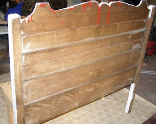
Wonder if she whistled while she worked? :-)

The finished product is gorgeous!


The detail on this headboard looks so "cottage-on-a-tulip-farm-in-Holland" to me, which totally appeals to my heritage and my love for all things Dutch...

I also had the pleasure of meeting Miss Jean Martha at Renovation Therapy who blogged about this PHENOMENAL headboard she plans on turning into a bench in the near future:

I CAN'T WAIT to see how this one turns out! It's one of the prettiest beds I've ever seen, and would have snapped it up in an instant too.
Lastly, Sharon S. posted this incredible Headboard/Dining Chair "Bench-For-Two" on Craftster.org :

Does this bench ROCK or what?!
The color of the seat, and multi-colored wood "skirt" on the front are SO pretty.
If I was any more inspired, I'd burst! :-)
Wednesday, January 28, 2009
Burlap-covered Cork Boards
As a follow-up to my post on "Misti's Flea Market Find" the other day, I thought I'd share these photos of the lovely burlap beauties one of my gracious readers led me to.
They're coffee sack-covered cork boards, and I think they are fantastic!


The woman behind all of this fantastic-ness is Maya, of

She did a wonderful tutorial on how to make these snazzy boards here.
I saw a couple of old burlap coffee sacks at the flea market the other day.
I think I have officially found my next project. :-)
Tuesday, January 27, 2009
Happy Tuesday!
Walk with a confidence in your step-
and really, really soak up the beauty that surrounds you.
SMILE BIG
and DRAW happiness into your life.
MOVE the world, like only you can-
you are as special and unique as this moment!
Monday, January 26, 2009
Flea Market Find - Footboard

My brain kicked into overdrive when I saw the photo.
I was instantly more drawn to the clean lines of the footboard, so I decided to focus on ideas for that piece.
Inspired by these scrumptious chairs...

...I started to think that maybe it could be the top of a giant bulletin board.
...and maybe the bulletin board part could be a thin piece of plywood, or luan, upholstered in old burlap grain sack material.
Like this one:
Since this one is so pricey, (and not the right size, I would HAVE to attempt stenciling the letters and numbers on a regular piece of burlap myself to achieve a similar look. :-)
I'd paint, and distress, the whole thing a creamy, slightly dusty, white color.
Last step- add some nailhead trim where the burlap meets the wood, and presto!
I created a drawing to give you a visual:

I've got a few more ideas swirling around in my noggin for you Misti....stay tuned!
Now I'm off to clip some daffodils for my Kitchen. Have you had your "flower fix" today? :-)
Layla
PS...Scroll down if you were wondering what the price of the Antique Bed was!
Sunday, January 25, 2009
Flea Market Find - Full Size Antique Bed
Stunning, isn't it?
Can you guess the price?
(Or more importantly, can you guess how BADLY I wanted to straighten up this booth!?)
Updated, January 26th: The bed is priced at $199.99!
Saturday, January 24, 2009
Flea Market Finds- Bedside Table & Pendant Light
I had two things in mind, while I scurried up and down the aisles.
My eyes quickly shifted, side to side, scanning each over-flowing, junk-filled booth, in record time.
The first item I was on the look out for was an inexpensive light fixture for my Reading Room.

I've always pictured something kind of whimsical in the Reading Room, because it is such a fun little space.
I rounded a corner and spotted this retro pendant light fixture, hanging from a tall, bamboo etagere:
I know, I know. It needs some work. But it was only $6.00, and I think it's got lots of potential! Imagine the metal "finial" part spray painted a dark brown color, and the shade replaced with a semi-sheer white fabric. Some interesting trim, around the top and bottom edge...can you see it? Lastly, I'll switch the regular-shaped light bulb, to a chandelier shaped bulb and voila! Instant whimsy!
We're installing a beadboard ceiling in this room, and I'm going to paint it the same light blue that my Kitchen is painted. Then we'll install white crown moulding and it'll be the cutest little ceiling in the whole house! :-)
I also saw an INCREDIBLE mirror for $39.99 that would work above this table in the Reading Room:
I'm going to think about it for a couple of days, and in the meantime, tape the shape of the mirror onto the wall with painters tape. Live with it's "invisible twin" for a few days. Just to make sure. $39.99 is a little out of my price range, and they don't accept returns at this particular flea market.
The other item I was searching for was a bedside table for the Guest Bedroom.
I knew how high it needed to be. (Three inches below my jeans pocket)
I knew how wide it needed to be. (Two and a half Ugg boot lengths)
I looked at nightstand after nightstand. Table after table.
None of them measured three inches below my jeans pocket, by two and a half Ugg boots wide. Many of them were too low, some of them were way too high.
Most were too expensive, and a few were just downright ugly.
Then I happened upon this dainty fella:
I was immediately sucked over to it. Like a giant magnet was pulling my body towards it and there wasn't anything I could do about it. :-)
The fact that it's slightly triangular in shape and the bottom is open, makes it perfect for this small room. Less legs = less floor space, and it's visually lighter because it's not a solid piece with drawers all the way down the front of it.
I'm not sure what color it'll be re-painted yet. Could be blue, could be white, could be sand. Choices, choices. :-)
 It'll look so nice with a pretty drape behind it, and a lamp sitting on top of it. Maybe a couple of blue-spined books, and a small silver clock. Oh, and a Good Jar, of course. :-)
Friday, January 23, 2009
Good Jars...they're back!


Over about a months time, I sat in a quiet, pretty spot and wrote down a list of 365 things that would make my day a little brighter.
I've transferred my list onto 365 small, fortune-sized, slips of paper and made a home for them inside lidded, glass wire-bale jars.
Each one of these slips state short inspirational sentences, that suggest simple things you can do, or look at, or think about, to ensure that you have a good day.

- Place one bedside, and draw one slip daily upon awakening.
- Use one as an interactive accessory in a Guest Bedroom, to make your visitors smile.
- Normally used to hold food items, these little jars look right at home on the window sill in the Kitchen, too.
Here's an example of what's inside:
Whistle while you work
Notice the colors of the sunset
BE a breath of fresh air
Hide a note for someone to find
Make a sandwich and cut it diagonally
Smile at everyone
Make a wish upon a star
Each jar is handmade, by yours truly, with love.
The price of each jar is $15.99, plus shipping and handling.
Click the Buy Now button if you're interested in receiving a little jar of goodness, and you'll receive it within 2-3 weeks!
*Edited 12/20/2009 - Due to our demanding design consultation and renovation schedule, we are not longer making or selling our Good Jars.
Happiness is Contagious

“The morning blahs, it turns out, is a real phenomenon, with positive moods – happiness, friendliness and warmth, for example – manifesting much later in the day,”
That's what lead researcher Nancy Etcoff, Ph.D. from Harvard University has found to be true. She went on to say,
“Interestingly, when we placed a small bouquet of flowers into their morning routines, people perked up.”
Dr. Etcoff is referencing the fact that participants in the study responded to the flowers, which had been placed in rooms they frequented in the morning. Overall, the participants reported they liked to look at the blooms first thing in the morning, particularly in the Kitchen.

The final study results demonstrate that flowers impact people emotionally at home, causing them to feel less anxious and more compassionate. They even reported a boost of energy that lasted through their day.
“What I find interesting is that by starting the day in a more positive mood, you are likely to transfer those happier feelings to others – it’s what is called mood contagion,” says Etcoff. “And, the kitchen is the place where families tend to gather in the morning – imagine how big a difference a better morning mood can make.”
New York City floral and garden designer Rebecca Cole, host of Discovery Channel’s Surprise by Design, is not surprised by these findings.
“I grew up with a kitchen often decorated with flowers,” says Cole. “My family knew instinctively that flowers brought joy to the people who came in contact with them – and now there is scientific proof.”
Cole shares her floral design experience with others, showing them how to use flowers to capture emotion and encourage community in their kitchens.
“There are so many places for flowers in the kitchen – the room where we spend most of our waking time,” says Cole. “From the breakfast nook to the table to the countertop, flowers just belong. It’s even the most convenient room to change the water!”
I've included some photos below, to coordinate with Rebecca's descriptions.
Wouldn't it be amazing to wake up to fresh flowers in the Kitchen everyday?!
Here are Rebecca's ideas:
• Cut flower stems short and place flowers in interesting or everyday kitchen containers such as tea tins, jelly jars, salt and pepper shakers or even pretty wine glasses. Pick something to match your personal style.

• To make a big “wow” statement, choose lots of one type of flower. Take off the leaves below the waterline and place them in a big jug, teacup, coffee tin or water pitcher for a burst of cheer.
• Select surprising color combinations to make a bold statement. For example, try red, yellow and purple stems in a grouping of small vases.
Or, use monochromatic flowers, from one color family, to create a simple, pleasing effect.
• Choose brightly-colored flowers for a happy feeling. Place a bud vase holding a few stems of yellow and orange blooms inside a bowl filled with oranges. Or, place a narrow vase of flowers inside a wider, but equally tall, vase. Fill the larger vase with lemons or limes to surround the smaller vase for a fresh look.
• Play off of accent colors in your kitchen to bring a splash of color with flowers. Look around and match flowers to decorative wall plates, placemats or curtains to pull out key accent colors.
• Line three bud vases or decorative bottles, low or tall, along the middle of your kitchen table or along your sink for a fun, dramatic effect. It’s also a great conversation starter when guests drop by.
• Inspire neatness. Place flowers where kitchen clutter typically congregates to prevent future messes from settling there.

“What could be simpler than bringing home a few blooms to brighten your kitchen table and your mood?” says Cole. “Experiment, design and smile.”
Thursday, January 22, 2009
Lettered Cottage Dining Room Paint Color

I don't know why I said that the color I used in the Dining Room was "Softer Tan" yesterday. It is actually Sherwin Williams, "Rice Grain". DUH! :-)
Layla
Wednesday, January 21, 2009
Dining Room Update - January 2009
Newly installed beadboard panelling, that flows in from the Kitchen, to create a seamless, cottage look.
New wall color, that speaks to the countertop in the Kitchen, and creates a soothing coastal palette throughout the two rooms.
There are only two solid walls in the Dining Room, the other two have big, giant openings on them. The two solid walls always looked so FLAT to me. Nothin' but floor to ceiling drywall.
I love the addition of the new wall texture, and the visual interest it creates vertically. It will really get those eyeballs movin' on up, when the window is decked out, and the framed photography is hung by the homeowner with care. :-)
Check it out!
In the meantime, I'm off to blow my nose for the 1,398,458th time...cough, cough.
Accessorizing- Traumatizing, Mesmerizing

Do you have a "fear of accessorizing"?
Do you pick up, and put down, and pick up, and put down accessories at the store, afraid to commit because, while it looks so pretty there on the shelf, it might not work in your house?
Have you ever driven all the way back to the store because when you got home, you realized that thing might just work after all?
Did you pray the whole car ride back to the store that it would still be there when you arrived?
Have you ever driven all the way back to the store, the NEXT DAY, and it was gone and you're still thinking about that thing to this day?
I think one way to conquer a fear of accessorizing is to look to those who accessorize best.
Photo Stylists.
After all, they're the ones responsible for making us swoon, page after page, while flipping through the pages of our favorite shelter magazines, right?
Take the photo above, for example.
What a wonderfully accessorized, calm little corner.
The whole vignette could be put together pretty inexpensively too.
To achieve this exact look, search for:
1. A small, flea market find, dresser.
- Choose a dresser that's the same tone as the window blind.
- The use of one, consistent wood tone really reinforces the feeling of calm this photo evokes.
2. Two, 16x20, thin black frames.
3. Two, 16x20, white mats.- You can find frames like these at Michaels for $7.00 a piece. I like to use frames that look skinnier on the front, and have a thick profile, on the side. Since there isn't much horizontal space here, hanging them on top of each other really takes advantage of the vertical space, and fills up this corner nice and symmetrically.
- Looks like they used two 16x20 mats, which hold one 5x7, and one 8x10 photo in each of the frames.
4. A table lamp.
- Make sure to choose one that is the right scale. The one in this photo doesn't have a big, chunky base. It is small enough in size to allow you to see the picture frame behind it.
- Also, choose one that maintains that sense of calm. This lamps silver tone is visually "light". If it was black, for instance, the corner might feel less airy than it does because its polished silver and reflective. It also pops against the black of the frame.
5. A small, round basket.
- Again, similar in color to the window blind and dresser, this
basket works so well here to create yet another texture.- Size-wise, it's low in profile. Perfect. Even with flowers in it, it still allows you to see much of the framed print above. If you can't afford to keep real flowers in it all the time, use faux ones, until you have company or a special occasion, then replace them with real ones. Another idea would be to fill it with large, white seashells, to achieve a similar look.
- To give it some European-inspired appeal, use a stencil, taped onto the basket, and paint on black letters and numbers of your choice.
6. A miniature, wooden stool.
- The smallest item on top of the dresser, this little guy offers up the most visual pop. It helps ground the whole ensemble and adds a touch of whimsy and eclectisism to an otherwise pretty grown up selection of accessories. It also ties in nicely to the color of the frames, for a well-rounded look.
7. A chair.
- The chair in this photo has an open back, which lends to the light and airy feel of this corner. Brilliant.
8. A box-shaped, lidded basket.
- The use of a basket that has a lid is crucial in this situation, since this particular basket is placed low enough to see it's contents as you walk by it. It will also provide storage and will guard the seat of the chair from accumulating laundry. (ha ha)
9. An upholstered ottoman.
- Again, this could be a flea market find that you reupholster
yourself.- Pay attention to the wood tone of the legs, making sure it's similar in color to the other wood tones.
- Reupholster it in a creamy fabric that will really make it stand out in front of the dresser.
10. Floor lamp.
- Something skinny, but dark, to speak to the
picture frames is perfect. It's feminine lines suggest a
warm and cozy vibe. A straight, rod lamp base wouldn't have
the same appeal.
And there you have it! Easy, breezy, Covergirl!
Now, tell me I'm not the only one that's driven back to TJ Maxx for something the next day!
:-)
Layla
Sunday, January 18, 2009
My Second Place
When Kevin and I sold our first house, on Hermitage Drive, we bought a brand new house, across the street from his Mom and Dads place.

This is the only NEW house I have ever lived in.
It was tiny, at just under 1200 square feet.
Somehow, the builder managed to squeeze in three bedrooms and two full baths.
Four months after we purchased it, we decided to make the move to Prattville, so we put it up for rent. Two weeks later, a couple of school teachers moved in.
I never got around to decorating or painting the Master Bedroom or Bath...

Both bright, blank canvases, with lots of potential. (The knobs on the vanity weren't right...too much contrast and too ornate for the space. I probably would have changed them to these stain nickel ones instead.)

We did paint the Living Room- but never fully accessorized it, and never purchased a rug...


The Kitchen was open to the Living Room, and I had plans to switch out the laminate countertops with some kind of natural stone material...

The front of the bar needed some sprucing up, and the light fixture would've been changed out before long too.
But, the Lettered Cottage was calling our name...so we packed up our paint brushes and hit the road to Prattville instead! :-)
It does make me want to throw out a few questions though- for those of you who live in (or have lived in) spaces under 1200 square feet.
What do/did you love about it? What don't/didn't you love about it? Do you have any great space-saving secrets you can share?
I look forward to reading all of your comments.
Thanks in advance for sharing!
Layla


