Last year, I did a Photo Consultation for a sweet gal by the name of
Katie.
She wanted some low cost/high impact ideas that would help spiff up her Living Room- so I sent her a bunch of suggestions and a inspirational photo drawing to help get her creative gears a-turnin'.
Here's what Katie was workin' with...
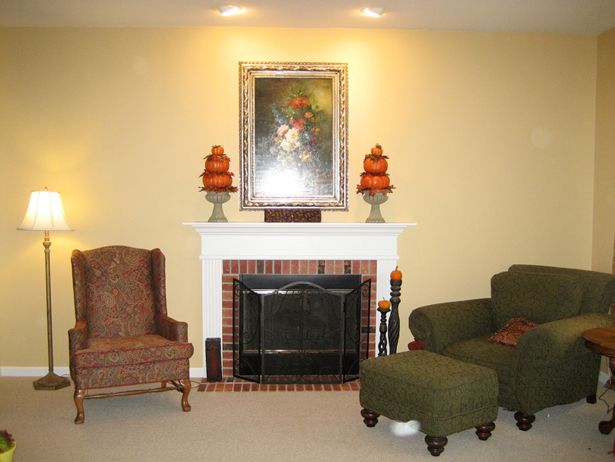
One idea I suggested had to do with beefing up her fireplace.
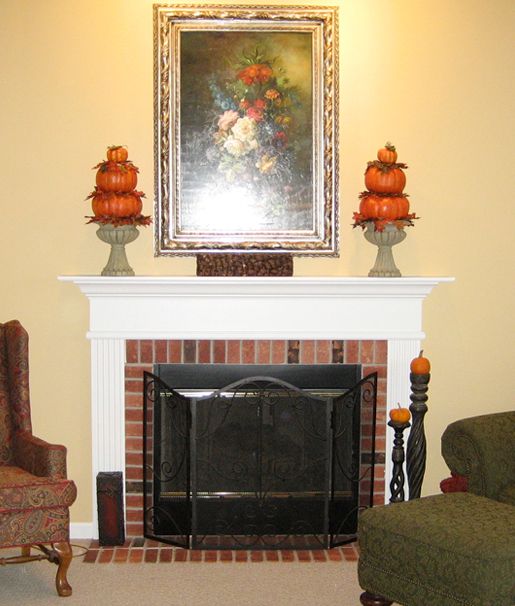
Since it was almost the same size as the furniture around it, it was really struggling to become the rooms focal point.
And it looked so tiny compared the wall around it.
I thought a little extra trim molding would help solve both dilemmas in a jiff.
(Move your cursor back and forth over the photo below.)
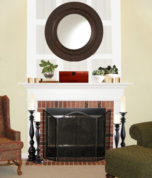
This week Miss Katie sent me a photo of the finished product...

Isn't it great!?
She came up with a great, low-dough way to replicate the candleholders I suggested in my drawing too.
She used spindles and spray paint!
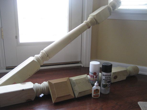
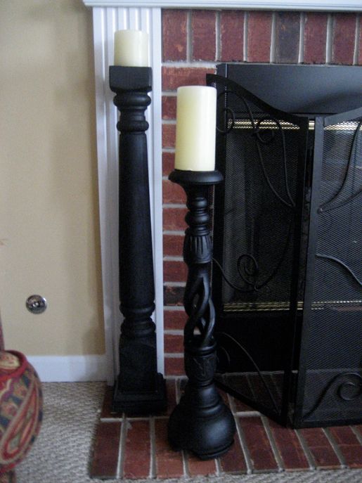
And what's reeeeally cool is that it only cost Katie 12 bucks to make each of them!
So awesome!
If you'd like to make some super-cool $12 candleholders, head on over to Katie's blog, Impatiently Praying For Patience to read her step-by-step tutorial.
-------------------------------------------------------------------------------------
In other news, tomorrow marks the 2 year anniversary of our blog.
It's crazy how fast time flies!

See ya mañana!

-------------------------------------------------------------------------------------
Need design help?
Check out my e-book!

Katie.
She wanted some low cost/high impact ideas that would help spiff up her Living Room- so I sent her a bunch of suggestions and a inspirational photo drawing to help get her creative gears a-turnin'.
Here's what Katie was workin' with...

One idea I suggested had to do with beefing up her fireplace.

Since it was almost the same size as the furniture around it, it was really struggling to become the rooms focal point.
And it looked so tiny compared the wall around it.
I thought a little extra trim molding would help solve both dilemmas in a jiff.
(Move your cursor back and forth over the photo below.)

This week Miss Katie sent me a photo of the finished product...

Isn't it great!?
She came up with a great, low-dough way to replicate the candleholders I suggested in my drawing too.
She used spindles and spray paint!


And what's reeeeally cool is that it only cost Katie 12 bucks to make each of them!
So awesome!
If you'd like to make some super-cool $12 candleholders, head on over to Katie's blog, Impatiently Praying For Patience to read her step-by-step tutorial.
-------------------------------------------------------------------------------------
In other news, tomorrow marks the 2 year anniversary of our blog.
It's crazy how fast time flies!

See ya mañana!

-------------------------------------------------------------------------------------
Need design help?
Check out my e-book!























35 comments:
That is so cool that you gave advice and she listened! I am in awe of blogland once again. I love your blog, too! Thanks for sharing.
-Desiree
The trim molding is such a great idea. Once that is up, is it possible to take it down easily if we move or want to redesign? I am always hesitant to make design changes like that because my husband tells me I change my mind too often and I'll get stuck with something! But I say, you won't know unless you try!
I like the molding too. It makes the fireplace the focal point and the greenery is cute!
I am a followers of Katie's blog - she's really a sweetheart! I love seeing you showcase other people's projects. I just adore your blog!!!
What a transformation! She really took your ideas and ran with them...and they turned out great!
-Gail
What a great Redo! Sometimes it's not all that hard to refresh a space. I just redid my little bathroom, and it's a totally different room. Not expensive, either.
The redesign looks great! Congrats on 2 years of blogging and thank you. I love reading!
Layla,
I LOVE your blog and the creative ways you help others with low cost, big results make-overs.
Keep up the great work. drop by and say hello sometime.
Luv your blog. Congrats on your 2 year anniversary.
Happy blog-iversary!
I wish I had a fireplace and not a crappy/ugly 1960s wall heater instead : /
Very nice ideas! I love the idea of painting the spindles black and using them for candle stick holders by the fireplace!
Another great idea- check out my blog-(yesterday's post) from another blogger to take vintage mirrors and frames and paint them white and hang them on a white wall, for a really cool textured white on white look!
love your blog!
XO Jill
Congrats on 2 years Kevin & Layla! I continue to use your daily posts for inspiration ... here's the latest post referring to your butcher block counter top ...
http://ginamillerdesigns.blogspot.com/
:O) Gina
I love your suggestions. I am so impressed with the transformation.
Beautifully done!
What a great suggestion and it turned out awesome!
GREAT redesign!! as always!
That turned out so good!
Donna
Your suggestion was great and it turned out awesome! :)
Looks fantastic! And your 2 year anniversary is my sons 21st birthday! (:
Have a pretty day!
Kristin
Layla- it did turn out beautifully! And I am hestitant to even bring this up (but the engineer in me is troubled by this and can.not.let.it.go)
it looks top heavy to me now?
Is that just because I am so clearly lacking in all things decorating, or am I missing something...? I am truly, truly not trying to be critical!!! you do lovely work, and it is most definitly a MAJOR WONDERFUL improvement...its just....my ocd, engineering brain wants to put something on the bottom...
Hey Rhonda!
I think the reason you're feeling like it's "top heavy" now is because they decided to attach the molding all the way out to the furthest edges of the mantel. (Not in line with the molding on the fireplace below, like in my drawing.)
That being said, I agree with you- it's definitely a MAJOR WONDERFUL improvement, and I love it! :-)
Layla
Have to say the first thing I noticed also is that it looks top heavy now. Had they followed your design and not take it out as far, the proportions would have been much better. Still an improvement though.
I love that candle idea!! Might have to steal it...only not in black. P.S. Happy 2 Year Blog Anniversary!
I love this! It is always so fun to see your ideas come to life! Enjoy your day!
XO
Kristin
I love this! It is always so fun to see your ideas come to life! Enjoy your day!
XO
Kristin
Wow! What a difference it turned out great and love the candle stick idea!
Wow! It looks great!
My husband put up his DIY tutorial on making a headboard from bead board. You may like it! Not that you're a fan of bead board or anything! : )
http://herbanhomestead.blogspot.com/2010/05/80-headboard.html
HAPPY ANNIVERSARY!!!!
You two are a HOOT AND A HALF!!!!!
I don't always comment (oooh......that makes me a lurker, right?!?!) but I always stop by!!!
I've been severely BEATING my head against the wall out of frustration that HGTV has not offered you a full time show/gig yet!!!!
Seriously! I wrote about interior design (and fashion and the occasional political piece....) for YEARS for newspapers and magazines waaaaay back (I'm only 39 as of last month, but still, in computer time a couple of years is like a century!!!) when a decade ago before all these blogs popped up and I'd like to think that I somewhat know what I'm talking about!!! :)
I just started blogging a couple of months ago and am crazy busy w/ being a mom to 3 and just finished my Masters and had a music career for a while (loooong story there) so I came to blogging late....but I LOVE IT and YOU are JUST A BEAST!!!!
Seriously....YOU ROCK!!!!
Yes, you show us amazing, affordable design, but the thing I love most about you guys is YOUR SENSE OF HUMOR.
I renovated a 100+ year old home with my husband (again.....waaaaaay back when.....they didn't even have camcorders back then...okay, that was a lie....we had 'em but didn't think to utilize them to show the Before/In the Middle of/After CRAZINESS) and so totally get what your passion is.
Keep it up.
I know it must be financially hard to keep plugging away being a musician and an artist (and yes, dear, you ARE an artist--interior designer somehow demeans what you are--you are a true artist) but I will keep praying that all of your dreams come to fruition.
I hope your dreams/HGTV stardom come soon, because, man, my head is hurting
;)
MANY blessings to you and HAPPY ANNIVERSARY,
Lana
PS I found you from our mutual friend, Rhoda. She's been one of my biggest bloggie friends as I've just gotten started a few months ago.
We literally just made an offer on a house an hour ago that this would work great in! There was also a lamp left over and I thought...Layla would LOVE that lamp!!! I hope we get the offer and the lamp is still there. HA!
Oh, I am so glad someone else said something too. I do think it is an improvement, but I too think that it is top heavy now. It would look better if they followed the drawing you did, where it was in line with the fireplace and not the mantle. My two cents...I know, not worth much to anyone else. :)
Layla,
Congrats on being mentioned in the new Nesting Newbies Magazine. YHL had a link up this morning and your blog is listed right next to theirs!
Michelle
Another wonderful Layla idea! I also love the mirror above the fireplace. They always add light and the reflection opens up the whole room. You are so clever with your cursor move across the picture. Would love to know how you do that!
What a great makeover. Very pretty and creative.
I want to do this exact design with my fireplace. Check out my fp on my new blog and tell me how you think it would look....
www.clearlycandi.blogspot.com
Gotta agree with those who find it top heavy. It would have been perfect if they had followed your design suggestion. Other than that it does look very nice!
Post a Comment