


I found these inspiring images while surfing the web the other day, and just had to share them.
I named this little house we live in the "Lettered Cottage" because of my love for all things typography-related. Also, I'm married to a writer, and find myself displaying books, quotes, words, letters and numbers in every single room.
This tablecloth really speaks to me. I love the variations of dark and light gray in the type, and the layering of different fonts:

The next two photos gave me inspiration for accessories to use in my Kitchen...

Items like these could be found in flea market, home stores and on Ebay.

That little tin crown in the photo above initiated an online search for others like it.
I found this larger one...

...and this one for sale at a brocante in Paris...

Photo Credit: Tara Bradford
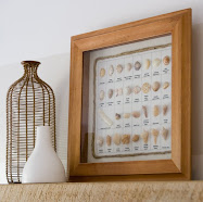
This last photo is my favorite. I could design an entire house around just these items.
I am crazy about the de-saturated look they all have. I may be forced to re-think the palette I've chosen for my Kitchen now that I've seen this. (Kevin's gonna kill me) :-)

Images:
Also, I'm still looking for my Craft Magazine Contest Winners...
"Cottage Rose"
"Shannon @ Silver Trappings"
"Drama Queens Mum"
...to email me with your mailing addresses so that I can mail you your magazines.
Congrats ladies!
:-)


18 comments:
I love to see all the ideas you post. If it makes you feel any better I just painted my kitchen and I've been thinking about changing the color too, LOL..Shh don't tell my husband..he will croak and then repaint it, LOL.
{{Hugs}}
Cathy
I prefer "barely-there" colors. They are so soothing. Thanks for sharing!!
I put your (picture)link on my sidebar. I really enjoy your blog.
Hugs, Kelly
I love this quiet palette, and as for the crown, I got one just like it at Homesense which, I think, is akin to your Homegoods.
You can see mine here: http://restyledhome.blogspot.com/2008/09/wow-factor.html
Great photos, Layla!
Oh, wow! Thanks so much! How fun to win your give-away!!!!! I'm so excited!
This post has some beautiful pictures - as always!!!
Thanks again. Have a great week.
Shannon
I love your post for today. My kitchen and dining room was a medium brown color, and I decided that I wanted a lighter color, so I mixed up some white with a little bit of the brown that I had left, and painted over the darker brown with it. My daughter said that she liked the darker color better and that I shouldn't have so many light colors. I told her that houses with lighter colors and lots of white look really nice. Then I showed her this post. We both had a laugh! She still likes the darker colors better! :)
Love those colors myself, and someday, I would like to have a name for my cottage as well. I'm thinking of "Le boite de bijoux" meaning the jewelry box. It's an ongoing joke between my husband and I that since we bought this cottage, we will not be able to buy each other a gift anymore. When you have time, check out my blog about my little cottage at
http://mariesmarche.blogspot.com/
Thanks for sharing your talent with us.
-marie
Layla, I can make you one of these tablecloths! I would be honored! Melaine at mysweetsavannah!
i think we were separated at birth.. LOL ;) seriously though.. it never ceases to amaze me how similiar our taste is! and these images especially speak to me.. ok ok.. they're Screaming at me!!
Love the barely there color as well, keep thinking next home, or change the color I have, so many great ideas! love the inspirational kitchen photo!!
LuLu
I can see why you're inspired. Ahhh... that last picture is perfection!
I am alway inspired by this kind of palette. So peaceful and elegant!
I have noticed the crowns are very popular with my European bloggers. Very cool. I love the tablecloths, too.
Thanks for finding the pictures to share!
Carolyn Packer
Hi Layla~Thanks for explaining your "Lettered Cottage" I have been wanting to ask where the name came from. I too have a love for words on everything and scattered throughout my home. Great pictures, love the tablecloths!
~Misti
of course I love that palette too!
of course I love that palette too!
Gorgeous! And LOL about your paint changing urge. I painted my stairway wall a gorgeous sage and was tired of it in 30 minutes. Back to my ever so soft palette it went pretty fast. I can relate!
And don't feel too bad. I had just painted my bedroom and then hung a big ol antique 4x8 sign for the headboard. (on my current post) In 2 hours the bedroom was repainted. Now I want to paint the wall WITH the sign a deep crayon red to enhance the sign lettering. Let's just put it this way.. I'd rather paint than wash a wall any day! :)
I'd sure like a viewing of your dining room reveal too.. waiting waiting...
Jo Anne's has a great collection of oversized letters this season that are paintable but are a light weight cardboard. Just in case you haven't been in there lately.
Have you seen this silverware chandelier from Arhaus? (Not sure if you know Arhaus.com - very cool stuff.)
http://shop.arhaus.com/carty/?r=0&c=Spoon%20and%20Fork%20Collection&w=TESTCHANDELIERS
It's $599!
Post a Comment