Wednesday, February 25, 2009

Flea Market Finds and a Re-Design!

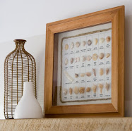
I scored this big, old picture frame at the flea market for $4.00! I'm not sure what I'll do with it, or where I'll put it, but I couldn't pass it up for that price. For the time being, I hung it on a nail that was already sticking out of the wall above the mantle.


My Mom made me the grapevine wreath, which is also temporarily hanging on a nail that was already there. I really just hung them both there to get them up off the floor, but my friends like the way it looks...silly wabbits. :-)


I also picked up the old, black, full-size headboard pictured in photo, for $20! I've been looking for one for the Guest Room bed, and because of my infatuation with caning, this one is just perfect! Not sure what color it will end up, or if it will stay black, but whatever the case, I just love it.


I'm working with a client here in Alabama today, and spent the entire day yesterday clearing out the room and closet, cleaning and re-painting. Oh, my achin' bones....

The room we're working on is inside a tiny cinderblock cottage. The cottage itself is made up of only three rooms total- the main room (which is only big enough for a bed and a couple of other pieces of furniture), a small kitchen, and an itty-bitty bath.

My client decided we should tackle the bedroom portion of the cottage first. She wanted me to help work in more storage space and make the closet more functional. There was also no specific style in the room, and she longed for a fresh, updated, cottage vibe. We settled on a palette of navy, chocolate brown, khaki and white. Here's a hint at the decor, we bought four of these baskets from TJ Maxx:


Today is the fun part- moving in all the flea market/salvation army finds, accessorizing, organizing, etc. I've been shooting video and taking pictures, so I'll share the results of the re-do here on my blog very soon!
Oh, and the best part....everything will be done on a budget of $300!

Layla
PS...I added some info towards the bottom of the "Ford Re-Design" post that Mrs. Ford shared with me yesterday, for all of those who had questions about certain elements of the design. :-)


Sunday, February 22, 2009

Ford Re-Design AFTER PHOTOS


Yesterday I got an email from the
Ford Family, who were my very first Virtual Design Consultation clients. They sent me these pictures of their Kitchen last October:


They explained that there wasn't a spot for the fridge in the room, didn't want to do any major renovating, and were fine with keeping it where it is located- right outside the Kitchen door, in between it and the breakfast nook.

I put together this layout, for them to use as a guide, which they used to create their new Kitchen:


I turned the Ironing Board closet into a nook for shelves, since it was mandatory the small flatscreen TV stay in this room:


The color I recommended was Benjamin Moore's "Paper White":


The Fords had this to say about the color,

"The color you chose is absolutely perfect. I would have never chosen that color. Even the swatch made me question and then when I had to pay for the paint (we normally don't spend alot on paint) I wondered why I was paying that much for "white" (with a touch of grey) paint. Now I know. It works beautifully and has great coverage. Not to mention, the white-grey paint makes the room SO MUCH LIGHTER."


I also recommended this stainless steel trash can, to tie in with the new stainless steel appliances...

...and these galvanized light fixtures, for $18 each at Lowes:


Design plan in hand, they began ripping down, throwing out, sanding, prepping, caulking, priming, painting and installing:


And here is the Kitchen today...what a beauty!


Countertop is Carrera Blanco by Zodiac:


I'm sure it was an extremely challenging project, that probably felt like it would never end, but WOW, was it worth it, or what?! :-)
The dark-stained hardwoods look amazing- GREAT job. The heavily distressed black kitchen cabinets look custom and like they cost a fortune, but in all reality, they are stock cabinetry and only cost about $500 total- awesome. The big porcelain "EAT" letters came from an antique shop. They used to be part of a sign that spelled out "Goodyear Tire". What an incredible find! I love that they kept the vintage light fixture above the Kitchen sink too. So much charm. There's a perfect balance of old and new throughout the space.


I want to thank the Fords for giving my Virtual Design service a shot, and commend them for all the hard work they put in to make this design a reality. The Kitchen is STUNNING. I hope you enjoy it for years to come!


Edited February 23 to include this information from Mrs. Ford:

"The paint color is Cannonball from ACE Hardware Store, in an eggshell finish. We painted one coat and let that dry completely. Then, with a hand sander, we roughed it up- trying to remove any sheen. Then, we hand rubbed two (some got three) coats of wax on everything. I know that they have not been in there very long but they have held up quite nicely. Water beads up because of the wax, and I have scraped drips of paint, caulk and thinset/mortor off of them and I have been really happy with their durability. The light fixture above the sink is original to the house, which was built 1927. It has its own on/off switch on the fixture, so whatever light we switch it out with has to have one too. I have not found something else yet- however, the fixture itself is growing on me. The reason it hangs down so low, well, it's one of those cool fixtures that can go up and down. Only the mechanism is broken, so it is stuck, for now, at the position it is in. We need to take it apart and see what we can do with it. When I get the fixture I ordered for the ceiling, the two will actually match pretty well. The floor is stained Minwaxs "Dark Walnut". Then we used two coats of poly to protect it."


Layla


Friday, February 20, 2009

My Dream House


I happened upon the most perfect house today.
Just look at it! (sigh).


I LOVE the way the carriage house-style garage is positioned in relation to the house.
Almost like so that they can each admire each other from where they both sit.
:-)
I also love the w i d t h of the front steps. They conjure up images of BIG family get-togethers, where wide front step come in handy because everyone is trying to rush in, all at the same time.
Both new and old landscaping frames out the place perfectly. I'd spend hours on that porch watching the treetops blow in the breeze...just me, Mr.Right and a huge glass of Countrytime...extra sour.


And when it rained, I would get cozy here, with an old quilt, my laptop and my Maximus.

I would be so distracted from my laptop though...I mean, look at this place. (sigh)

Simple things, like the tone and way they laid the bricks on the fireplace could capture my attention for days. The wire obelisk planters to the left and right of the fireplace are sooo Linda Woodrum. They would make my heart sing everytime I looked at them!
Linda used them to the left and right of the TV in this house:

She always finds the best accessories. When I grow up I want to be Linda Woodrum.

:-)

The Dining Room is now featured as my background wallpaper on my computers desktop.

Everything about this room appeals to me.

The gracefully curvy seagrass dining chairs, that perfectly fit underneath the gorgeous smokey-blue colored dining table.

The row of clean-lined, antique-style pendant lanterns are incredibly divine, and their muted tone couldn't be any more perfect for the space. Black ones would have been too heavy-looking, and whoever chose these lights deserves a huge hug! :-)

The built-in plate rack/hutch piece of furniture is one of my favorite things in this whole house.

And by displaying octagon-shaped white plates, the hutch instantly has a more updated feel. Clean-lined and Traditional with a Contemporary twist...my favorite!

The angled ceilings in the Master Bedroom really give this space a comfy-cozy feel.

The teeny-tiny windows on each side of the bed add a bit of whimsy and maximize the amount of natural light that floods this room. The one on the left side of the bed would perfectly light up the pages of a book, while reading in that luscious creamy wing-back.

The use of "nightstand slipcovers" is very interesting to me. It seems as though the designer must have very intentionally wanted to soften all the hard edges in the room, and there is something very peaceful about the way it looks and feels because of his/her attention to details like these.

The transom window and pocket door in the Master Bathroom are also little details that would never go unnoticed if I were fortunate enough to call this place home. The Moroccan Star hanging lantern in the water closet is an unexpected and delightful touch. What a clever choice! Positioning the deep soaker tub under the window, between the two sinks gives the space such a wonderful focal point and creates such amazing symmetry. The shape and thickness of the sinks even mimic that of the tub....genius!

Thanks for sharing these photos Daisy!

This is truly my dream house.

Maybe one day....(sigh)

:-)

Hanging Fruit Scale


I want this for my Kitchen soooooo bad...
Thanks for the inspiration photo Catherine!

Thursday, February 19, 2009

Flea Market Finds- Vintage Book and Cast Iron Pedestal


Oh how I love my little cast iron pedestal.
It's ever-so-slightly whitewashed appearance reminds me of the sea.
I pretend it was purchased at an open-air flea market in Paris, where it was rescued from an old place like this...


The same day I brought my pedestal home, I also purchased this vintage book for Kevin.

It was $2.00.


It's titled, "What color is Love?"...


I'm going to mail it to him today. :-)


There is such a sweetness about the green linen cover. The pages smell just like you'd expect 34 year old pages to smell....warm and musty, in a good way...


The story inside reads:

An apple is red.
The sun is yellow.
The sky is blue.
A cloud is white, and a stone is brown.
The world has many things, the world has many people, the world has many colors and each one of them is different.
In a garden all the flowers are different colors, but they live happily together...side by side.
In a forest all the birds are different colors, but they live happily together...side by side.
In a meadow all the animals are different colors, but they live happily together...side by side.
In our world all the people are different colors, and, sometimes, they live happily together...side by side.
Colors are important because they make our world beautiful, but they are not as important as how we feel...or what we think
...or what we do.
Colors are "outside" things, and feelings are "inside" things.
Color is something we see with our eyes, but love is something we feel with our heart.
An apple is red, the sun is yellow, the sky is blue, a leaf is green, a cloud is white...and the earth is brown.

And, if I asked you, could you tell me...