


I haven't shared one of my Virtual Consultations in a while, so I thought I'd blog about one today.
Who knows?
Maybe it'll help somebody else that's battling with a similar design dilemma!
Dilemma: How to arrange the furniture in a super small living and dining room that are open to each other.
Mission: Come up with a great space plan!

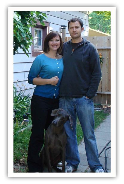
Meet Meredith and Nick (and their dog Jack!)...
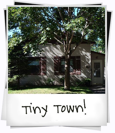
They live in a little house called, "Tiny Town", in Canada...
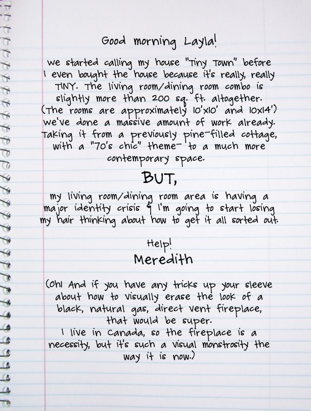
Meredith sent me a letter about their pesky design dilemma...
Meredith also sent me some "Before" photos of Tiny Town...
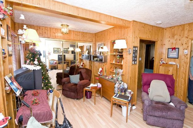
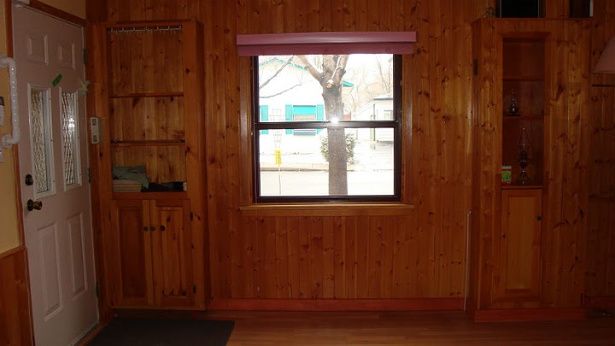
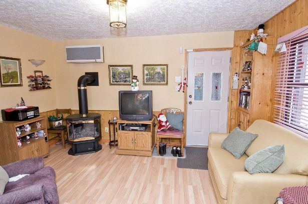
And she sent me some "this is what it looks like now" photos too...
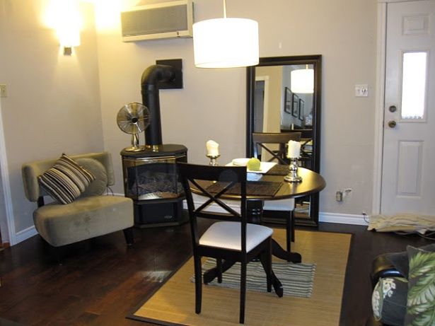
She also sent me a bunch of awesome inspiration photos to look at before I started putting together my drawings.
Here are some of the photos she sent me, and what she liked about each of them...
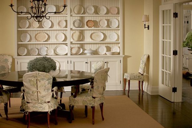
1. Contemporary Coastal
"I love this room! It's almost exactly what I'd like in Tiny Town! TV on the wall, moldings, dark wood and bright light. The mood and layout is bang on."
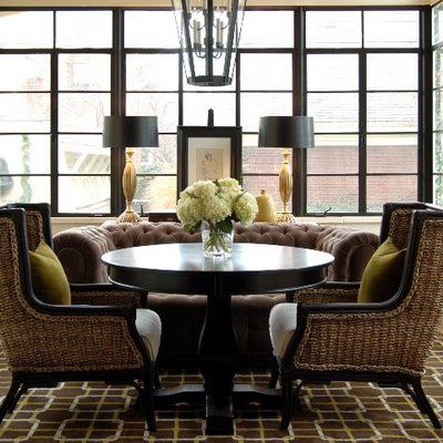
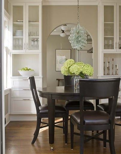
2. Divine Dining
"I'd eat breakfast at this table EVERY day...and maybe not make it to work on time EVERY day ;-) Dream. Dining. Room. From the carpet, to the chairs to the windows, to the table (got it!) to the hydrangeas."
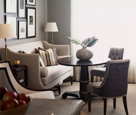
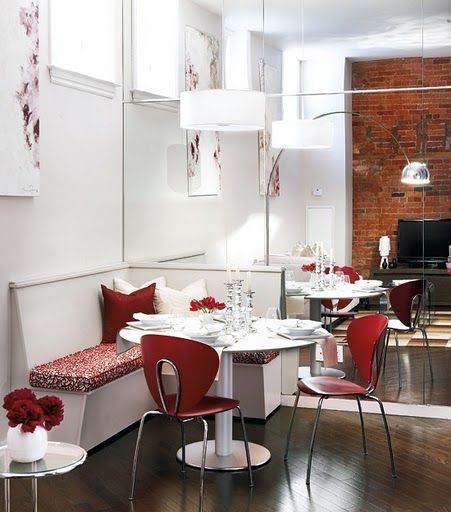
3. Exceptionally Elegant
"Love almost everything about this room except that the colour scheme is a bit too cold for Tiny Town. Oh, and the gold accents aren't me. But the banquette and the easy, breezy feel, the black framed art, the round table and that beige chair (got it!) are wonderful."
4. Remarkably Reflective
"Ooh ooh ooh! A banquette and a mirrored wall!" :-)
5. Crisp and Clean
"Hydrangeas and built-ins. Two of the finest things in life. Ha ha!"
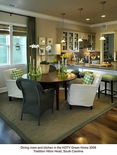
6. Green Living
Love a lot about this room- including my dream of taking down the wall between the dining room and the kitchen; the green accents, the natural blinds (got 'em), the round table, the comfy chairs, the accent lights and the white, molded windows.
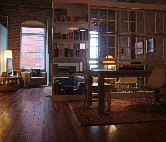
7. Loft Love
"This is just gorgeous, but perhaps not practical for anything in Tiny Town. But wouldn't it be great somewhere to salvage those windows and use them like this loft?!?"
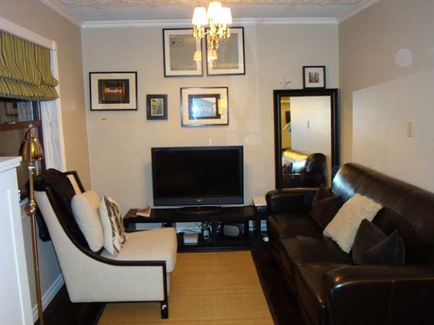
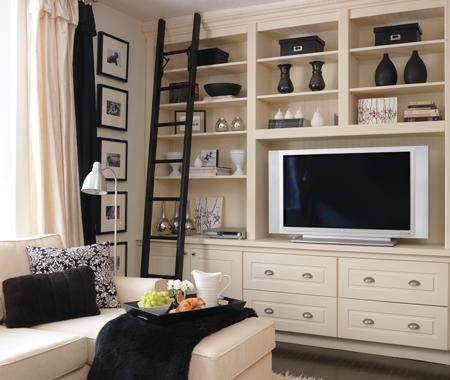
10. Black and White, and Bright All Over
"Storage and a place for a big TV to live (or hide!)."
12. Fab Finishing Touches
"Transoms, transoms, transoms. And beachy walls. And of course, the guest bathroom door, (which I did for my bathroom too) and the wonderful sunny light."
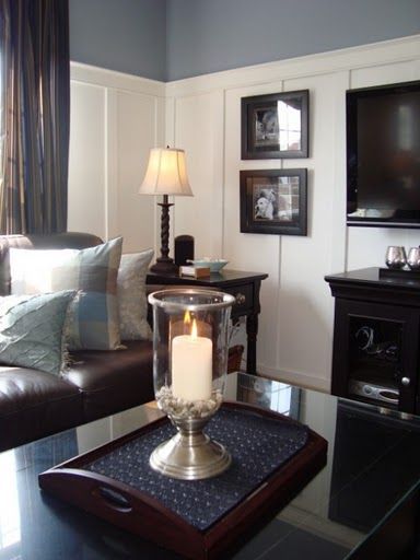
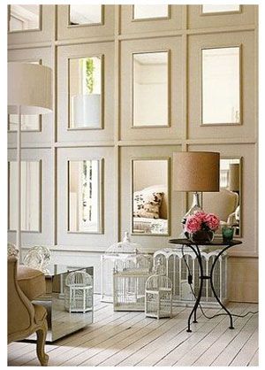
14. Groovy Grid
"Kinda cool. Molding and mirrors. Two things that work well for Tiny Town."
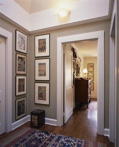
15. Beautiful Bungalow
"I can feel the craftsman style in this one. Thick thick moldings, art work and taupe walls."
16. Smart & Spacious
"Black door. Pears. Visual flow through the rooms. And mini spruce."
Meredith not only sent great inspiration photos, she also sent me a bunch of photos of things they already had that may/or may not work into the new design.
Check 'em out...
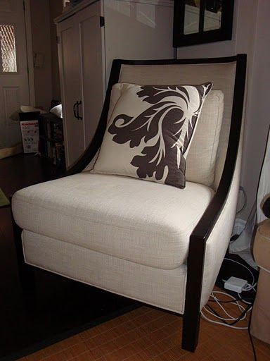
They have this super-stylish chair:
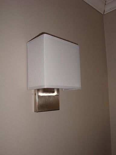
A pair of sensational sconces:
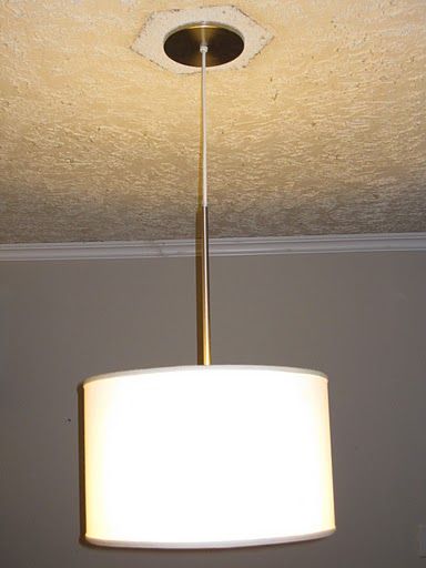
A pretty pendant light:
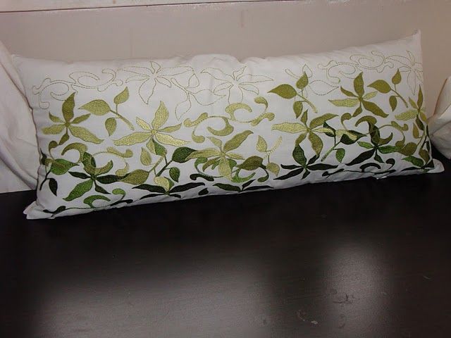
A handsome, hand-stitched pillow:
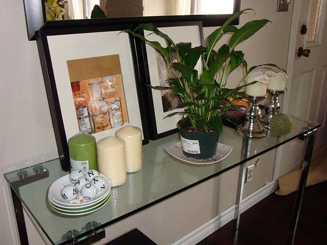
A snazzy glass console table:
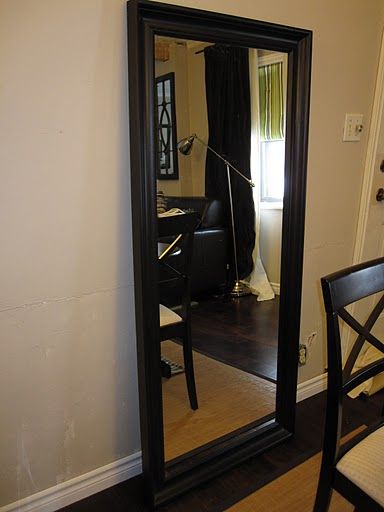
And a large, dark-framed mirror:
Great stuff huh?!
(I know! I thought so too!)
Anywho, I took all that awesomeness into consideration, and whipped up a new layout for Meredith and Nick (and Jack!) that I thought would solve the "which room is which?" dilemma.
Take a look...
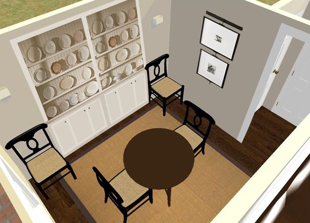
This first drawing doesn't show all the little details (like rugs, art and accessories), but I wanted Meredith and Nick to be able to see how everything was laid out from above.
That's really the best way to work out a rock-solid space plan.
(Don't know how to draw a to-scale floorplan from above? Check out my E-book and I'll walk you through the process step-by-step!)
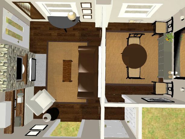
You'll notice I suggested they switch the two rooms around.
It just didn't "feel right" to me to have the dining room right inside the front door.
I also suggested they add a short, yet open, wall between the two rooms.
Now normally I wouldn't ADD a wall in a super small space- but I really thought it was necessary to give their couch something to back up to, so that the fireplace wall could become a true FOCAL WALL.
There isn't a true focal wall in the current layout, which is probably why the rooms are struggling to find their identities.
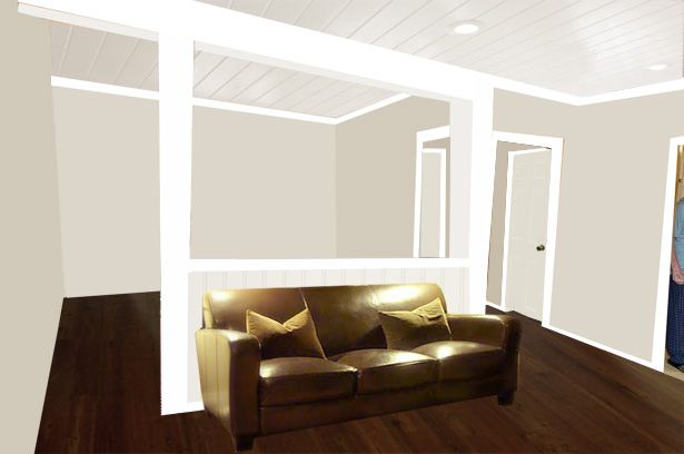
Here's an eye-level view of the "cut-out wall" I added between the two rooms...
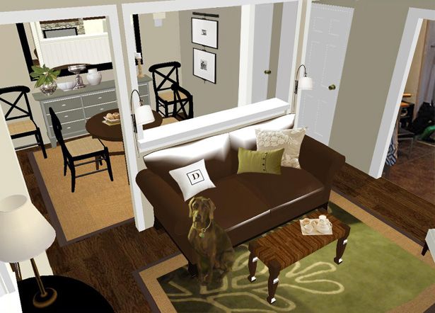
(I had to add Jack into this drawing!)
It created the perfect spot to put their leather sofa opposite the fireplace.
And since there wasn't room to sneak in side tables or table lamps, I suggested they use plug-in, wall mounted sconces instead.
Not necessarily the exact ones I used in my drawings, but I do think they would work...
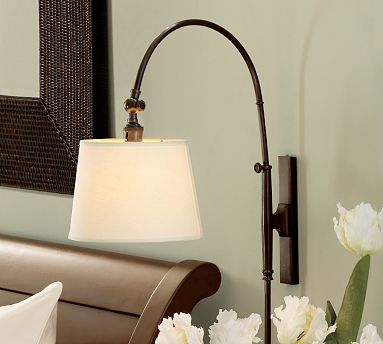
(PotteryBarn.com)
I also suggested she layer a large (8x10) sisal rug underneath her fantastic-looking green one. I think that will just add to the overall luxuriousness of the living room. And since this is the room you see right when you enter the front door, attention to luxurious details is extra-important in here.
Your entry (or living room in this case) should say "Welcome Home, Love! So glad you're here!"
(And for some reason, in my head, it's always said in an English accent. I don't know why. It just is.)

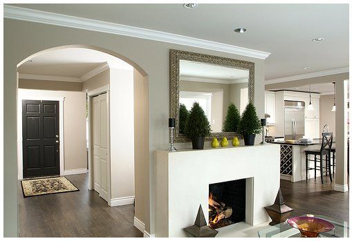
Here's a view of the new "focal wall"...
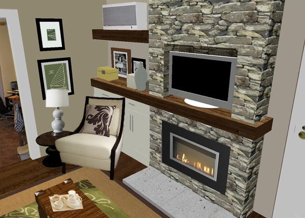
I suggested they build a shallow (12"-14" deep) "false wall", and then clad it in some kind of groovy material (stone, paneling, plastered drywall, etc.)
Then, they could hang a much flatter, direct vent, wall-mount gas fireplace to it and finally get to relax in front of the fire!
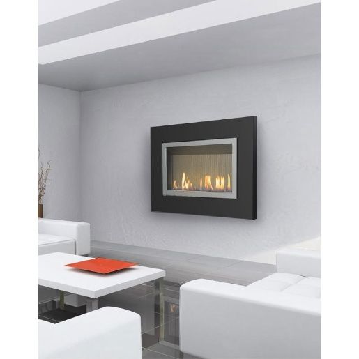
(Direct Vent, Wall Mount Fireplace. Click photo for details.)
They could also create a niche for their flat screen TV too.
That way, both the TV and fireplace are on the focal wall.
(The room is definitely too small to have competing focal points!)
And to really amp up the charm factor, I thought they might want to explore the option of using reclaimed timber to construct their mantel and chunky floating shelf under the (must-stay) air conditioner.
If reclaimed wood is too hard to find, they could just as easily distress and stain some new lumber, like we did for our mantel:
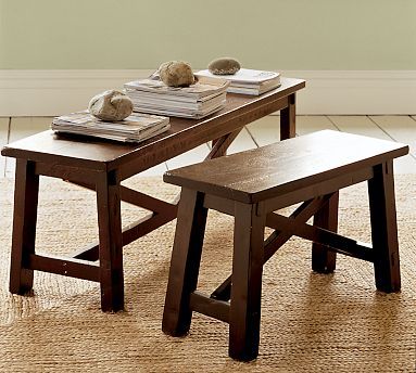
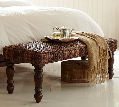
I suggested using a small bench in front of the sofa. One of these might work well...
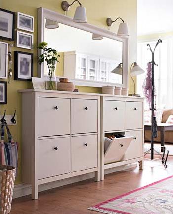
But, if they need more storage, a couple of these might do the trick...
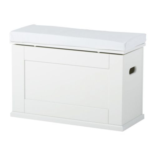
They look a little blah plain white, but you could really go crazy personalizing them. Paint 'em and re-cover the pad on top in the fabric of your choice, and voila!
A pretty place to prop your feet and hide your stuff!
And speaking of storage, I also suggested using a couple of these bad boys behind their awesome chair...
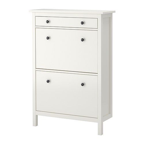
They're only 11-3/4" deep, so they'd work perfectly with the newly-added false wall!
Here's a shot that shows just how shallow they are:
Here's a drawing I did that shows the view from the dining room into the living room...
The ledge between the two spaces might actually work as a little "buffet", when they're entertaining. And since Meredith was a fan of wainscoting, I snuck in a little paneling below the ledge too.
On the largest expanse of wall in the dining room, I came up with a few different options for them to choose from.
One idea was to use a shallow sideboard and a large mirror, like I showed in the "Layout" drawing above.
Another idea was to draw inspiration from the floating shelves and the custom-built counter in Jennifer's dining room...
And another idea was to draw inspiration from the "Something's Gotta Give" dining room:
Since Meredith said she loved built-ins, I just had to suggest it!
And if they reeeeally wanna open up the space, they could back the shelves with mirror...
The sky's the limit on that wall. As long as it's shallow, they'll be good to go!
And one last item I thought was important to mention was the piece of furniture near the front door.
I suggested using a demi lune table that had some storage in it- something like this would be great:
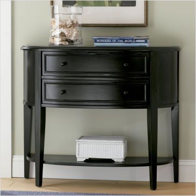
Using something with curved edges in that spot will really soften the transition into and out of the doorways in that area, and free up a few extra inches of floor space too.
Always a plus in a super small space!
Finally, just for fun, I thought I'd include a rough Presto Chango photo drawing of what once was, and what could be.
(Just move your cursor back and forth over the image below to see the room "magically" transform!)
This space was so much fun to work on!
I find that the more difficult the design dilemma is, the more I enjoy the challenge!
I knew they were a handy family, and not afraid of construction, but I didn't know if they'd be up for making all the changes I suggested in my consultation or not.
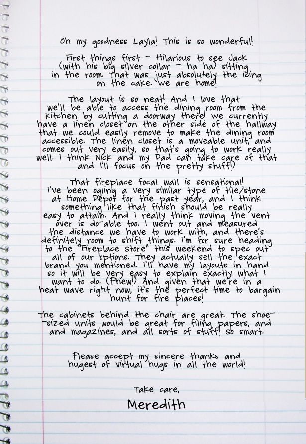
So you can imagine my relief when I got this letter back from Meredith...
Woo Hoo!
They're gonna do it!
I don't know about you, but I cannot wait to see their "After" shots!

PS- If you're on my waiting list for a consultation, I haven't forgotten about you!
I'm working my way down the list, one design dilemma at a time. I appreciate your patience, and I'll continue to "ease on down the re-design road" as best as I can!
-----------------------------------------------------------------------------------
The winner of the Leen The Graphics Queen $50 Gift Certificate is...

Lemonade Makin' Mama
Congratulations!
Whenever you're ready to order, feel free to contact Eileen at leenthegraphicsqueen@gmail.com and she'll hook you up with the vinyl of your choice!
-----------------------------------------------------------------------------------
Need space planning help?
Check out my e-book!

Who knows?
Maybe it'll help somebody else that's battling with a similar design dilemma!
Dilemma: How to arrange the furniture in a super small living and dining room that are open to each other.
Mission: Come up with a great space plan!
Meet Meredith and Nick (and their dog Jack!)...
They live in a little house called, "Tiny Town", in Canada...
Meredith sent me a letter about their pesky design dilemma...
Meredith also sent me some "Before" photos of Tiny Town...
And she sent me some "this is what it looks like now" photos too...
She also sent me a bunch of awesome inspiration photos to look at before I started putting together my drawings.
Here are some of the photos she sent me, and what she liked about each of them...
1. Contemporary Coastal
"I love this room! It's almost exactly what I'd like in Tiny Town! TV on the wall, moldings, dark wood and bright light. The mood and layout is bang on."
2. Divine Dining
"I'd eat breakfast at this table EVERY day...and maybe not make it to work on time EVERY day ;-) Dream. Dining. Room. From the carpet, to the chairs to the windows, to the table (got it!) to the hydrangeas."
3. Exceptionally Elegant
"Love almost everything about this room except that the colour scheme is a bit too cold for Tiny Town. Oh, and the gold accents aren't me. But the banquette and the easy, breezy feel, the black framed art, the round table and that beige chair (got it!) are wonderful."
4. Remarkably Reflective
"Ooh ooh ooh! A banquette and a mirrored wall!" :-)
5. Crisp and Clean
"Hydrangeas and built-ins. Two of the finest things in life. Ha ha!"
6. Green Living
Love a lot about this room- including my dream of taking down the wall between the dining room and the kitchen; the green accents, the natural blinds (got 'em), the round table, the comfy chairs, the accent lights and the white, molded windows.
7. Loft Love
"This is just gorgeous, but perhaps not practical for anything in Tiny Town. But wouldn't it be great somewhere to salvage those windows and use them like this loft?!?"
10. Black and White, and Bright All Over
"Storage and a place for a big TV to live (or hide!)."
12. Fab Finishing Touches
"Transoms, transoms, transoms. And beachy walls. And of course, the guest bathroom door, (which I did for my bathroom too) and the wonderful sunny light."
14. Groovy Grid
"Kinda cool. Molding and mirrors. Two things that work well for Tiny Town."
15. Beautiful Bungalow
"I can feel the craftsman style in this one. Thick thick moldings, art work and taupe walls."
16. Smart & Spacious
"Black door. Pears. Visual flow through the rooms. And mini spruce."
Meredith not only sent great inspiration photos, she also sent me a bunch of photos of things they already had that may/or may not work into the new design.
Check 'em out...
They have this super-stylish chair:
A pair of sensational sconces:
A pretty pendant light:
A handsome, hand-stitched pillow:
A snazzy glass console table:
And a large, dark-framed mirror:
Great stuff huh?!
(I know! I thought so too!)
Anywho, I took all that awesomeness into consideration, and whipped up a new layout for Meredith and Nick (and Jack!) that I thought would solve the "which room is which?" dilemma.
Take a look...
This first drawing doesn't show all the little details (like rugs, art and accessories), but I wanted Meredith and Nick to be able to see how everything was laid out from above.
That's really the best way to work out a rock-solid space plan.
(Don't know how to draw a to-scale floorplan from above? Check out my E-book and I'll walk you through the process step-by-step!)
You'll notice I suggested they switch the two rooms around.
It just didn't "feel right" to me to have the dining room right inside the front door.
I also suggested they add a short, yet open, wall between the two rooms.
Now normally I wouldn't ADD a wall in a super small space- but I really thought it was necessary to give their couch something to back up to, so that the fireplace wall could become a true FOCAL WALL.
There isn't a true focal wall in the current layout, which is probably why the rooms are struggling to find their identities.
Here's an eye-level view of the "cut-out wall" I added between the two rooms...
(I had to add Jack into this drawing!)
It created the perfect spot to put their leather sofa opposite the fireplace.
And since there wasn't room to sneak in side tables or table lamps, I suggested they use plug-in, wall mounted sconces instead.
Not necessarily the exact ones I used in my drawings, but I do think they would work...
(PotteryBarn.com)
I also suggested she layer a large (8x10) sisal rug underneath her fantastic-looking green one. I think that will just add to the overall luxuriousness of the living room. And since this is the room you see right when you enter the front door, attention to luxurious details is extra-important in here.
Your entry (or living room in this case) should say "Welcome Home, Love! So glad you're here!"
(And for some reason, in my head, it's always said in an English accent. I don't know why. It just is.)
Here's a view of the new "focal wall"...
I suggested they build a shallow (12"-14" deep) "false wall", and then clad it in some kind of groovy material (stone, paneling, plastered drywall, etc.)
Then, they could hang a much flatter, direct vent, wall-mount gas fireplace to it and finally get to relax in front of the fire!
(Direct Vent, Wall Mount Fireplace. Click photo for details.)
They could also create a niche for their flat screen TV too.
That way, both the TV and fireplace are on the focal wall.
(The room is definitely too small to have competing focal points!)
And to really amp up the charm factor, I thought they might want to explore the option of using reclaimed timber to construct their mantel and chunky floating shelf under the (must-stay) air conditioner.
If reclaimed wood is too hard to find, they could just as easily distress and stain some new lumber, like we did for our mantel:
I suggested using a small bench in front of the sofa. One of these might work well...
But, if they need more storage, a couple of these might do the trick...
They look a little blah plain white, but you could really go crazy personalizing them. Paint 'em and re-cover the pad on top in the fabric of your choice, and voila!
A pretty place to prop your feet and hide your stuff!
And speaking of storage, I also suggested using a couple of these bad boys behind their awesome chair...
They're only 11-3/4" deep, so they'd work perfectly with the newly-added false wall!
Here's a shot that shows just how shallow they are:
Here's a drawing I did that shows the view from the dining room into the living room...
The ledge between the two spaces might actually work as a little "buffet", when they're entertaining. And since Meredith was a fan of wainscoting, I snuck in a little paneling below the ledge too.
On the largest expanse of wall in the dining room, I came up with a few different options for them to choose from.
One idea was to use a shallow sideboard and a large mirror, like I showed in the "Layout" drawing above.
Another idea was to draw inspiration from the floating shelves and the custom-built counter in Jennifer's dining room...
And another idea was to draw inspiration from the "Something's Gotta Give" dining room:
Since Meredith said she loved built-ins, I just had to suggest it!
And if they reeeeally wanna open up the space, they could back the shelves with mirror...
The sky's the limit on that wall. As long as it's shallow, they'll be good to go!
And one last item I thought was important to mention was the piece of furniture near the front door.
I suggested using a demi lune table that had some storage in it- something like this would be great:
Using something with curved edges in that spot will really soften the transition into and out of the doorways in that area, and free up a few extra inches of floor space too.
Always a plus in a super small space!
Finally, just for fun, I thought I'd include a rough Presto Chango photo drawing of what once was, and what could be.
(Just move your cursor back and forth over the image below to see the room "magically" transform!)
This space was so much fun to work on!
I find that the more difficult the design dilemma is, the more I enjoy the challenge!
I knew they were a handy family, and not afraid of construction, but I didn't know if they'd be up for making all the changes I suggested in my consultation or not.
So you can imagine my relief when I got this letter back from Meredith...
Woo Hoo!
They're gonna do it!
I don't know about you, but I cannot wait to see their "After" shots!
PS- If you're on my waiting list for a consultation, I haven't forgotten about you!
I'm working my way down the list, one design dilemma at a time. I appreciate your patience, and I'll continue to "ease on down the re-design road" as best as I can!
-----------------------------------------------------------------------------------
The winner of the Leen The Graphics Queen $50 Gift Certificate is...
Lemonade Makin' Mama
Congratulations!
Whenever you're ready to order, feel free to contact Eileen at leenthegraphicsqueen@gmail.com and she'll hook you up with the vinyl of your choice!
-----------------------------------------------------------------------------------
Need space planning help?
Check out my e-book!


48 comments:
Giiiiirrrrl! You KNOW that these posts make my heart skip a beat. This was no exception! LOVED every inch of what you came up with. I, too, can't wait to see if they follow up on anything! Such a cute space that just needs some extra love.
I love how much bigger the space feels...I'm sure they do too! :) My favorite thing (besides Jack!) is the half wall...great idea for the sofa placement. Love it all!
Hope you have a great week!
Blessings and Hugs
Melissa :-D
I'm no designer but the first thing I noticed was the need to switch the rooms--I was so excited when you did this!
Your suggestions are fantastic! I especially love the focal wall.
On a side note - thank you for suggesting that ikea storage bin with seat cushion. I have been looking for something like that to fill an awkward empty area in my kitchen and this is perfect!
Have a lovely day!
xx
OK, I know this is off topic, but Nick looks like Jason Mesnick from The Bachelor. :)
AWESEOME-NESS!!! I love Tiny Town.. can't wait to see it completed.
Whoo! One of your best virtual redo's yet! I love all the idea's I can't wait to see what happens. Good luck to them!
Oh My Gosh! How do you do this? Yes technically I know (I read your e-book) but to me it's no different than watching an artist create.
Bravo, my friend! You did it again.
Deborah
Great job Layla! Switching the rooms is a great idea and I love the fireplace wall and built-in in the dining room. Now, I have to buy your e-book to see what program you used for the drawings. I'm considering purchasing a new program because the one I use is somewhat limiting.
Beautiful work Layla. I'm amazed at what you came up with!
Oh my gosh!! I'm screaming! I mean, you can't hear me, but I really am!! And I just had the very worst day ever (and I realize this is a dumb reason according to some people) because I had my first ever cavity diagnosis. It has rocked my world. I'll never look at my toothbrush the same. Mainly because it let me down. But anyway. Thank you so much!!
I'm so happy. :)
Oh, and I love the room looks! Such great inspiration!
Layla.
I can only image what a beautiful room you could create in my home with it's many design boo boos.
I keep hoping I can get an original design by Layla very soon.
I think you took Tiny Town to a whole new level. I love the idea of the half wall with the bead board.
I know it will be so fun to see the results.
Cheers to you and your many gifts you share.
Geri.
O.K., Wow...I mean, really, Wow! Excellent design work for this small space! It's perfect and what a transformation! You've got a great design eye!
Can't wait to see their finished look!
xoxo Beth
Wow Layla, Love the design you came up with for Tiny Town. Very creative! I laughed when I saw the dog in the virtual pic! good stuff.
~Stacey
What great designs for such a small home - the half wall, switching the room order, the new fireplace - all looked like they were all do-able.
If anyone asks about the blue-grey colour in the first photo (Contemporary Coastal) it's called Pike's Peak Grey by Benjamin Moore. I saved the same photo from 'Rate My Space' and the home owner had listed her colours. :)
Congrats to Lemonade Makin' Mama on the give-away!
(the other) Sandra
Well done, Layla! I've been waiting for you to share another one of your virtual designs with us, along with that Presto Chango magic of yours...the real cherry on top. Thanks for sharing my dining room as an inspiration photo : )
oxox
Jennifer
Simply brilliant!
Layla, this is wonderful! I always love seeing your design consultations and really studied this one. We too have those open window things in our home seperating the entrance/dining room (one small space) and the kitchen. I've always LOATHED them but saw how well you incorporated them into the design. I'm anxious to switch things around in my house now! You did a fabulous job on this consult - as always.
Oh my goodness. I can't see how you were able to come up with such an awesome plan after my eyes were burned with the "before" (christmas) pictures. I could not pull my eyes away! I kept having to go back and look at those pics. There are no words. But your plan afterwards was amazing. Great job.
The only thing better than having you do a design consultation for my place would be having you snapping your fingers and doing a "presto chango" so I wouldn't have to do the work!
Thanks for sharing the whole process. I find it both interesting & inspiring.
Awesome job Layla.
I am becoming more and more of a fan. I love your virtual makeovers. This may be the best one yet!
You are amazing Layla! I love everything that you came up with. Oh and I totally thought of you this weekend as I was reading Better Homes and Gardens, there was an article about Mary Kay Andrews house on Tybee Island! :)
LOVE your fireplace idea - I have something very similar in mind for ours!
Layla! Gasp! and double gasp!! I truly can't get enough of your virtual designs--from tiny (my master bathroom) to Tiny Town--absolutely fantastical. Would you consider doing another e-book with a compilation of virtuals and presto-changos? ;) Outstanding job. Again!
Sindy
Thanks for the good luck wishes everyone -- we'll work hard at bringing Layla's amazing inspiration to life! (We had to google Jason Mesnick but, yes, I can see it too, HHG :-)) And Sindy, I also took Layla's ideas for your bathroom and put them all into mine. You're such a gift to us all Layla!
Are you kidding me?! FABULOUS!! I cannot catch my breath over here. I cannot wait for my turn. (I'm on your waiting list)
What a fantastic post! You are so incredibly talented, I might just have to hire you in the future!! Keep up the great work, It's so much fun to read!!
OH. MY. GAWD. I wanna live in Tiny Town! Can't wait to see the afters!!!!
What an amazing transformation! I can't wait to see the after pictures to see how the space actually turns out.
Fabulous! What a stunning transformation, Layla. God has given you a beyond great talent to create beauty and order so others can lead happier lives.
I can't wait to see this when they are done. And Meredith and Nick will be thrilled each time they walk into the door of their home.
xo Lidy
Too stinkin' cool. Can't wait for the afters.
Tiny Town is the place for me. Love the booth with the red pillows. Red and White are a delight!
Loved Meredith's inspiration photos! And Layla's design is great!
Love everything that you suggested. The room is absolutely fabulous . I may just have to move in.
Wow! I am so glad there are people to turn to when a home layout is that difficult to furnish. I hope they'll send you some pictures when they're finished, or along the way. Lisa~
Hi just a thought. If the dining room is a little tight to put a chair between the cabinet and table, try turning it so that the chairs are situated towards the corners for dinner.
I just wanted to say that I always enjoy reading your posts. You're so funny and always make me smile! Thanks for brightening my day!
I can't wait to see what they do with your suggestions... I love that cut-out wall!
Your idea's are always amazing and accomplishable for the average person! I love the wall opening!
Did you use sketchup for this?! I use it and nothing I've done looks quite that real. I love it!
Such a smart use of space. I love the white (narrow in depth) cabinets...where are they from?
Jana
OH my Layla..I absolutely love all the afters you came up with... such a tiny room and your made it look so much bigger... great going,, I hope they share their progress so we can see it.....
Hugs;
Alaura
This is why you do what you do. And this is why you have a blog. A great, and well-loved blog. Wow. I have to say, too, that the client did an outstanding job as well, providing you with all that detailed information. But what you did with it... Yum. Thanks for a great read.
- Michiganhome
LOVE the idea of the wall to seperate the 2 spaces. It really seems to define them both. SO glad they are gonna do it and I can't wait to see what it looks like after!
How are you on decorating a shared kids room? One a 3 yr old girl very much into pink and one a 9 month old boy? lol
Out of everything you suggested I am most impressed with the fireplace plan. It is absolutely perfect for that space! I love how the fireplace not only was transformed from the little stove to a real stone beauty, but also how you incorporated the T.V. and shelving! Wow! I am working on a plan for my fireplace right now and I think this one is great.
WOW Layla! This looks awesome! You are an amazing designer. What program do you use to do the virtual floorplans? They look great and would love to be able to use it with my clients at Ethan Allen. Thanks for sharing!
xoxo, Meredith
Super duper design Layla! You hit the mark - your suggestions are fantastic.
I love ALL the suggestions! And the program you use, makes it so easy to appreciate the size of everything. I also loved the sconce and chair that Meredith already had. Is there a way she could share where she got them? or maybe the name of the pieces so I can look it up online? Thanks for your blog Layla!
Hey Lizet! For what it's worth (as I got it all in Ottawa, Canada) the sconce is from Home Depot and the chair is from Home Sense, which I believe is only in Canada. Here's a great shot of my chair's higher-end cousin: http://www.barrymorefurniture.com/detail.php?cat=28&coll=152 You can use it as inspiration to source a local model. :-) Thanks for the lovely compliments! Meredith @ Tiny Town.
Post a Comment