


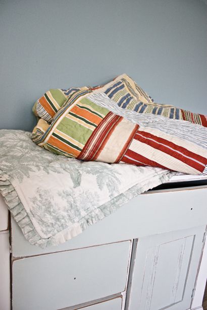
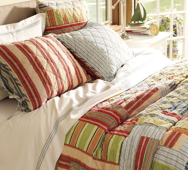
So, my Mom got us some great-looking bedding for our birthday's this year...
(Yes, we're 36 years old and we still get excited about birthday presents. Especially when they involve several pieces of our first, real grown up bedding emsemble.)
She got us the Grand Embroidered duvet (white, with Porcelain Blue stitching), and the Clearlake quilt and it's two coordinating standard shams. (all from Pottery Barn)
We already had the monogrammed Grand Embroidered boudoir pillow cover, and the two accent pillow covers- which by the way, also all came from Pottery Barn.

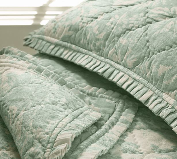
And if you follow us on Twitter, you already know about the Pottery Barn (Porcelain Blue) Matine Toile quilt and shams I won on eBay last week...
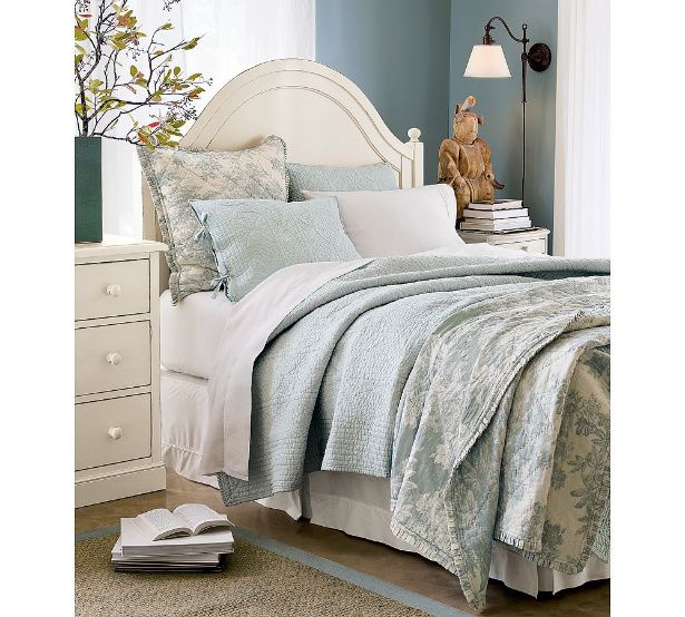
And if you read this post, you know that I was planning to use the color on this wall as my inspiration...

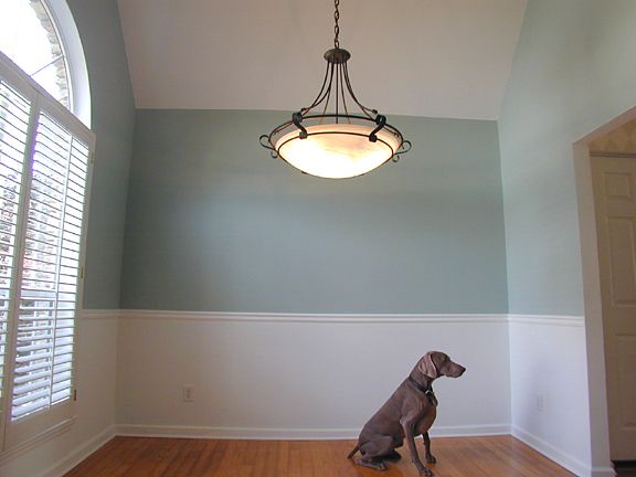
It's Benjamin Moore's "Wedgewood Gray".
So one day a couple of weeks ago, while I got my roots painted at the hair salon...

Kevin painted two of our bedroom walls to see how it would look.
But unfortunately, Wedgewood Gray ended up looking a little too Wedgewood BLUE.
In our room, it actually looks more like it does in this photo...
So I started having doubts.
And I started having discussions about re-painting...
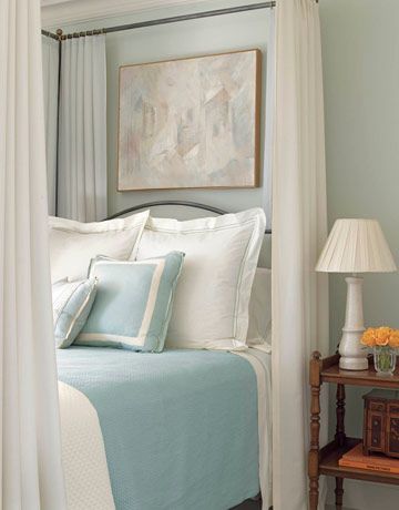
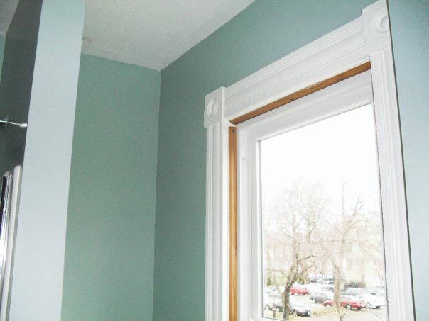
And since it was sorta hard to see the actual colors on the video, here's a photo that shows a truer version of what's goin on...
See how good that soothing Sea Salt looks with those beautiful blankies!?

There is one more color I might get a sample of too though.
(Why not, right?)
It's called "Blue Hubbard", and it's made by Sherwin Williams.
Phoebe Howard says this about it...
"It's a grayish blue I've used many times. My clients are crazy for it. There's just enough green in it to keep it from being icy."
Sounds good to me!
Here are a few more pretty blue-greens I considered trying out...
Abbe from Studio Ten 25 used Sherwin Williams "Rainwashed"...
Gorgeous, huh?

But after seeing this photo of a Rainwashed-painted bathroom, I thought it might look too bright in our room during the day...
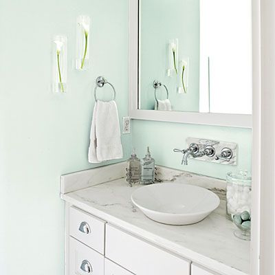
(Our master bedroom is the brightest room in the house.)
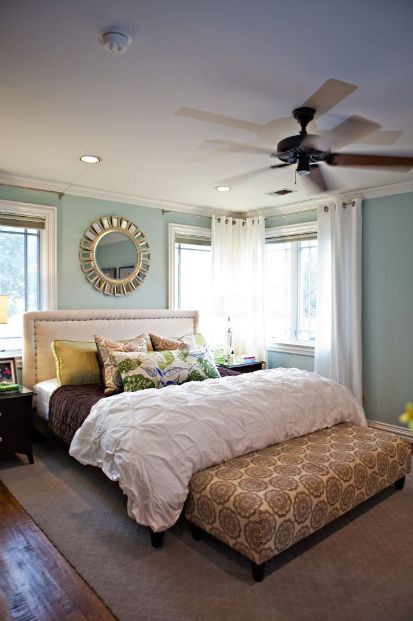
I also toyed with the idea of using Sherwin Williams "Quietude"...
Heather at Create H, used it in this awesome house...
...but I'm thinkin' it may be a little too "Wedgewood GREEN" for our room, if ya know what I mean.
(But what a BEAUTIFUL color it is though, huh?)
So I think it's gonna come down to either Sea Salt or Blue Hubbard...
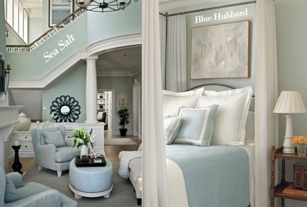
It really just depends which looks better with Mr. Clearlake and his trusty sidekicks- Sham-a-lama and Ding-Dong...
Yes, I'm 36 years old and I create crazy names for my beautiful birthday bedding too.

PS-
If you want some more great blue-green inspiration, check out this post over at Design Esquire
-------------------------------------------------------------------------------------
Want sneak peeks of our projects before we blog about them?
Follow us on Facebook or Twitter!


-------------------------------------------------------------------------------------
Need help arranging your furniture?
Need design help?
Check out my e-book!


125 comments:
Your birthday bedding is simply gorgeous!! What a cheery pattern!
hilarious that you called your bedding "sham a lama ding dong". my husband's name is sam and i call him samalamadingdong!!
i totally name inanimate objects all the time! it's not weird. i swear!
i think the sea salt is lovely... i've been trying to convince my boyfriend that every room in the house should be a shade of blue-grey! so far, just the bedroom is winning.
Paint is so tricky when you actually see it on the wall of the room you want it in. It's just never quite the same as you imagined :P
Have fun trying out those other gorgeous colors. Hope Kevin doesn't have to re-paint too many times!!
We used Wedgewood Gray in our TV room and as part of our stripes in our kitchen! It def. is more blue than Gray, but I think the color name comes from the blue in Wedgewood dishes, but since it has so much gray to tone it down, they threw that into the name! Who knows! ;)
He, he. My son's name is Camden, and I call HIM Cam-a-lama-ding-dong. I'm totally sold on the Blue Hubbard for the walls in my new kitchen - I'm painting the cabinets a nice, dark navy, much to the confusion of my family. Thanks for the inspiration!
melshortshares.com
Beautiful colours! What a choice! i like Blue Hubbard, but it's definitely a close one :) can't wait to see which you choose.
City Girl x
Sea Salt!!!
my mom is ding a room using the fabric of the quilt you got from ebay...and she got a color from Valspar called Jekyll Grand Dining Sea Mist..haha , yes thats really the name, it is from the Historic Colors of the National Trust
for Historic Preservation collection.It is from a group of colors all used in the Jekyll Island Club. Don't be fooled by the paint chip, it looks like a gray on the sample but is a subtle blue green mist color.( a tad on the greener side) try it on a wall....
So Layla, I LOVE all the combos and I too dream of changing winter, spring, summer and fall bedding! =) ALSO, I have the "Pearl" Embroidered Duvet and Boudoir pillow in porcelain blue! AND I happened to find sheets at Walmart (WHAT?!) that match the porcelain blue EXACTLY! I think they are the Canopy brand! Love to watch you and Kevin...addicted to the blog!
Layla I too have a bunch of bedding in the porcelain blue from PB and our walls are done in "Quiet Moments" by Benjamin Moore, a gray/blue that is almost an exact match. We have a big bedroom with high high ceilings and even with all that paint it is still very mellow and soothing. Just a thought!
I love your bedding(s)!! I kind of do that seasonally, too....I have shams and accent pillow covers that I switch out. I tend to do reds and golds in fall/winter, and more whites in the summer. I also have a cool taupe and white florally print comforter set from Cost Plus Imports that I have pulled out from time to time (my other cover is a white quilted from Target.) I just love change, and rotating is a great way to accomplish that! Good luck with your paint swap, I'm sure you'll find that perfect color! ;-)
~michelle~
I *love* that Blue Hubbard. Seems perfect.
Loving the "Blue Hubbard". One thing you may want to consider if you can't find exactly what you're looking for is creating your own color by mixing some acrylic paints and then having it color matched at your local paint store. I've done it many times and it always comes out just the way I like it! ;o)
Kristin
WHY WHY WHY can't I find that Clearlake Quilt on the PB website? It's EXACTLY what I've been searching for! I love all the colors in it. I've been using a PB quilt on our bed for 9+ years and it's time for an update! Sea Salt went in our hall bath, and I was impressed! Obviously we can't see the colors with your lighting and such, but I'm sure the end result will be perfection!
i would pick sea salt. can't wait for the reveal. keep up the great design work.
SEA SALT! thanks for featuring CreateH's photo. I have more pictures of Sea Salt and Comfort Gray, which is the next darkest. I actually work for Sherwin Williams, so if you need ANYTHING feel free to give me a shout! heatherrbourgeois@gmail.com :)
Heather
Too clever in every way! (pssssst- no way you have any roots_ But you do have great hubby and great birthday gift givers.
Love your new bedding! I just painted my bedroom a similar color to what you're going for. I tried Wedgewood Gray and about THIRTY other colors, but in the end, wound up mixing my own. I am SO happy with how it turned out. (It's on my blog if you're interested). Happy painting! Oh, and LOVE those inspiration photos!!
I am currently going through a similar dilema in our kitchen, dining area, and hallway, except with green paint. I don't know if I will ever be happy.
I know that Sea Salt is very similar to Restoration Hardwares Silver Sage (which I have in our bathroom) and it is beautiful!! I hope you pick it! It's a very soothing color, not gray, not green, and not blue, but somewhere in between. I can't wait to see what you pick!
Cindy Logan
I used Sea Salt in my living room and breakfast area, LOVE IT! it is a sun filled room dark wood floors. Love your Blog!
You might like Blue Gray by Farrow and Ball. We have it in our office. and it's just the right combo of blue and green.
I concur the paint's gotta change... Bummer for you, Kevin, but awesome for Layla that you're willing to go the extra mile and a half : )
I concur the paint's gotta change... Bummer for you, Kevin, but awesome for Layla that you're willing to go the extra mile and a half : )
OMG I Looked forever for that bedding and they sold out like the second they put in online and in catalogs! You are so luck to have it-- if you ever decide you don't want it, please let me know!!! I can't believe you have the Clearlake bedding. Consider yourselves lucky.
I just painted my bedroom walls the exact color you want. It's Ben Moore's "Palladian Blue"and it is amazing. Every. single. person. that come to my house compliments me on it. Have fun!
I would never have paired Sea Salt with the bedding you have, and it is GORGEOUS! This is why I read your blog--to see what is possible. :)
I tried the Wedgewood Grey for my family room and it was Waaaaaay too blue. Almost baby room blue. I was so disappointed. Haven't found a color I like yet. Your room looks great though!
We used "Quietude" on our bedroom walls and love them. So calm and relaxing!
Ok. This is too weird. I just went through the same exact paint dilemma. I wanted just the right blue for my bathroom ceiling, and I ended up going with Ocean Air by BM. My next choice (if that didn't work out) was going to be Blue Hubbard. Luckily, Ocean Air did the trick. It's a different area than you're using it for, but I just love it! Love the bedding!
i tried to change my kitchen colors from dark red and sage to that color blue with a hint of turquoise but in decorations it all kept ending up the wedgewood blue. it's still something new but i love that more greeny blue! love just looking at your designs!
Layla,
The bedding is BEAUTIFUL! We have used a color called Gray Cashmere by Benjamine Moore in two of our houses and it may be just what you are looking for! Give it a looksy :)
Layla,
The bedding is BEAUTIFUL! We have used a color called Gray Cashmere by Benjamine Moore in two of our houses and it may be just what you are looking for! Give it a looksy :)
Layla! Thank you so much for the shout out on your blog today! I love your site by the way!!!
Your precious and Max is a doll!!!
Hi Layla & Kevin.
Well I have been know to repaint & repaint and you handle it wayyyyyyy better than we do. hehe
I used Behr waterfall mist & also had it mixed at Loews using Valsar.
I had been looking for a while and landed on this color.
WE are in LOVE with it. It is calming and has the sea foam color with the grayish blue as a hint.
I tried a bunch but love this in bright light and in a darker room. Very beachy.
I used the wedgewood on my kitchen cuboards but it felt to thick and dark in the room.
Let me know if you likey.
I know whichever you pick I will go "ga-ga" over.
Have a painters Thursday. geri.
OMG!!! I am so glad I am not the only one that has this problem,lol sorry but I bought 12 paint samples because I just couldn't find the right gray/blue combination. They all looked too blue, it makes me so upset after about $50 in paint samples I decided to paint my office black, crazy huh? but check out my blog it looks awesome. Anyhoo good luck I am sure you will find the right color soon.
Thank you for all your beautiful postings! :)
~*~*Oh Layla you are sooo funny!Loved watching your little video snippet..you and your hubby are darling together! Anyhoodles...your bedding is so fun and vibrant and your nightstand is perfect for your space~LOVE the blue hubbard too!!! Good luck and Im sure whatever color you pick it will look awesome~*~*Blessings,Rachel Oh and btw your painted roots turned out lovely too!lol..
Totally love you guys! The video was awesome...has anyone ever told you that you should have your very own TV show?? ;o)
The poor nightstand looks naked! Kevin, sorry I created more work for you with the handles. I just didn't want to drill different holes until I knew for sure Layla liked the handles with it. If you position them just right they will cover up the original holes from the knobs. Hopefully you will have enough strength left after you repaint those walls. haha...
~mary~
Have you thought about Benjamin Moore's "Grey Wisp" It has green and blue undertones. I have grey wisp with board and batten wainscotting and I love it ;-)
Love the bedding! We have RH's Silver Sage in our bathroom. We really like it and it seems similar to the Sea Salt. It is one of the only rooms we haven't repainted so that certainly says something! :)
Blue Hubbard gets my vote!
I love your bedding and I think your color choices look much better than the Wedgewood. SW also has two other blue/green colors that I have used. I painted my master bath Filmy Green and I love the color! Also Comfort Gray is another good one...just a little deeper than Sea Salt. Good luck!
I love your bedding! I really want the toile from PB!
what about restoration hardware's "Silver Sage". We used it in our bedroom with bedding almost EXACTLY like the blue bedding you won on ebay and it looked great. I can send you a pic of our room if you'd like to see it. RH's Silver Sage is my absolute FAVE color. It is neutral and goes with just about anything. It's just enough neutral and just enough sage...but, it looks silvery blue to me.....I'm sure you know what color I'm talking about. :)
first time commenter...but I had to. YOU"RE GOING TO LOVE ME!!! I have THE color for you!!! I have Pottery Barn porc. blue comforter set also. An older style though. A colorist designer came over and suggested I do a monochromatic look in the bedroom. So she whipped out all her fan decks and picked the perfect color. It matches exactly! I have loved it for the three years we've had it, The color is... from Home Depot
Behr - Sparkling Spring !!
You can write me at : THE COOLEST THING
lornaboot.blogspot.com
i would pick blue hubbard - and I seriously might consider it - not sure....I have a black sleigh bed - so the contrast might be too much?
aaahh...the possibilities! thanks for the blue hubbard option :)
They're both gorgeous. I want to toss Silver Sage from Restoration Hardware into the mix. I have it in all of my living areas and it's fabulous! Although it may be more green than you are looking for. :) Lisa~
You are much more qualified at these things than I, but have you considered "Silver Sage" from Restoration Hardware? Don't let the "Sage" part of the name scare you away. It definitely has a blue hue to it. I bet it would be beautiful at only 25-50% of the full color. It might be just what you are looking for. I thought of it right away when I saw your pictures. It's worth a try. I have it in both my dining room and living room. I get comments on it all the time.
I just read Lisa's comment above mine. We may be onto something.
My favorite all-time blue paint color is Araucana Blue from Martha Stewart. It is a paint color from Valspar and Sherwin Williams, so you may be able to get them to still mix it. The color changes during the day from blue to green. Love it.
Oyster Bay from Sherwin Williams is my ALL time favorite. we used it in our old home and got a million and one compliments. good luck with paint! whatever you choose will be amazing:)
hi guys -
i am totally coveting your new bedding set (and yes, i have no shame). LOVE. IT.
and layla - i laughed out loud when you introduced your furniture oops, i mean "the man with the camera" as the 'lucious love of your life'. nice save! ;)
btw, i sent you a pic of our old living room painted in oyster bay so you could see it:) good luck! i only use sherwin williams paints, and have tried sooo many of their colors. can't wait to see what you choose:)
I love the bedding!!!! Out of the two colors, I think I like Blue Hubbard better but the Sea Salt is really pretty.
Love all the bedding! I kept moving the screen up and down compairing the paint colors to the bedding. I think Blue Hubbard will go great with all of the things you have so far....The Sea Salt has a bit to much green I think for the bedding. But what ever you decide to do with the room, I'm sure will look Spectacular as usual :)
Blue Hubbard! And I feel your pain. I painted my room three times to get the right blue gray. It kept being too blue. I finally went with Behr's Pensive Sky, but I had my local paint store mix it up. LOVE IT!
Hi sweetie, you two are so cute ! !! If you want another suggestion for a great gray blue, try 'Tranquility' by BM Affinity. I have it on my living room walls, love it!! But I confess, I tweaked it a bit, I made the BM Boys pull two drops of blue out of it to make it grayer, because I'm just such a troublesome creature.
Whatever you choose will be splendid, I'm sure !
xo
Kate
http://www.centsationalgirl.com/2010/07/living-room-the-latest/
Benjamin Moore's Grey Wisp is the same color as Restoration Hardware's silver sage ;-)
I'm right in the middle of deciding on a new color for our master as well much to my hubbys displeasure. We are putting in new hardwood this weekend in there so I figure now is the best time. I'm leaning towards Comfort Gray but I really like the Blue Hubbard you posted.
I love your birthday bedding, beautiful colours :)
(and I ♥ the third photo with frames ! :) )
I've always found that blues/greys are a difficult colour to get just right and I've been in exactly the same situation where I've finished painting and ended up not liking it after it dries completely.
As for your two colour choices, I was totally loving the Blue Hubbard until I noticed the photo of your bedding directly below the split photo of the two rooms. Sea Salt is a very complimentary colour for your quilt.
Oh, decisions, decisions!!! Just remember that if you don't like it after a second paint you (Kevin) can always repaint for a third time!
(just kidding, Kevin...my hubby and I have an ongoing joke about the 'we' factor in home improvement projects, as in 'we' are going to plumb the new toilet in, or 'we' are going to stain the fence...when really I mean 'him')
Beautiful! I just bought a can of gray for my living room - paler than yours (dark, north facing room). Have a great day!
-Trish
Happy Birthday!
Take a look at Olympic's "Morning Fog". My husband has had to stop me otherwise I'd have every room in the house painted that color.
I love the Sea Salt also.
After reading about it on your blog, I'm using sea salt in my new bathroom, and possibly in my craft room too. Another nice color that's a little bluer than sea salt is quiet moments (BM), which I put in my entry way. I think my favorite color is silver sage (BM), although that's definitely more green. I'm excited to see what yours looks like when it's all done!
GOOD MORNING LAYLA YOUR BEDDING IS FAB ! JUST THROWING ANOTHER PAINT COLOR YOUR WAY I USED SILVER SAGE IN SOME ROOMS IN MY HOUSE IT IS A RESTORATION HARDWARE COLOR IT IS A SOFT GRAY GREEN-BLUE COLOR !!
I KNOW WHAT EVER COLOR YOU PICK YOUR BEDROOM IS GOING TO BE BEAUTIFUL !
HAPPY PAINTING !!!
WARMLY
JANET
I am constantly changing my choice of paint colors. It never looks the same from the paint chip to the wall. But my all time favorite is Restoration Hardware silver sage. It is a beautiful blue-gray-green color. Give it a try!
I do love the sea salt too...and your inspiration!
We were planning on wedgewood gray for a bathroom in the new house based on photos similar to the one you used for inspiration, but we've since rethought that plan after seeing quite a bit more where it came out as a much deeper blue. We've since changed the plan to Palladian Blue or Woodlawn Blue from BM.
I used Sea Salt in our half bath, and I love it! I actually sampled Blue Hubbard, and I found that it is almost identical to Sea Salt. I had the two colors sampled on the wall next to each other, and my husband thought I had painted two samples of the same color - they are that similar. Good luck! Everything you do always looks fantastic.
Can't wait to see what color you choose. I have debated these same colors all summer. One is too gray, another too green, or too blue. And lighting changes everything. It makes my head spin. So I have a dining room/kitchen with patches of all of these colors.
Blue Hubbard has my vote...hmmm now I'm thinking of painting a room in our house, lol. Too bad we are finishing up projects/already have paint...and we are planning on putting our house up for sale this fall. BUT that means I will have a whole new house to paint!!!
Sea Salt!!!
So, I know that you have no idea who I am and apparently I am the last person in the world to find your blog. But I had to laugh when I was reading your post about the Wedgewood Blue being to blue because the first thing that came to my mind was Sea Salt. We just painted the bedroom at our beach house that color is it is the perfect shade of gray with just a hint of blue at certain times of the day. Anyway, good luck with your choices.
crack me up! sea salt all the way!! i heart pb, too. xxxxx
Try restoration hardware's silver sage. It's that bluey/silvery type color. We have it in our bedroom, bathroom, and a lighter version (made by me) in the kitchen. Wish I had some pics to show you, but I would be ashamed to show what I have now...everything is pretty much in limbo. :)
Layla, I just used blue hubbard for a client! It is beautiful and I think you would love it!
I really like the colour it is at the moment, but I see what you mean about it looking less gray and more blue with the fall/winter bed covers.
I really love Sea Salt as a colour, and I prefer it to Blue Hubbard. I think BH is a bit TOO neutral, whereas SS is calming but still with a touch a colour to it.
It's nice to know another experienced painter/DIYer also has trouble getting paint colors just right!! I frequently doubt the color that was "perfect" and now looks not so right. Thanks for sharing this! Good luck on finding Mr. Right Paintcolor! (I like Sea Salt BTW, ;)
Re: BLUE HUBBARD...It's been discontinued BUT sherwin williams will still mix it.
My daughter used this in several rooms of her house and it is GLORIOUS and changes color.
Best. Color. Ever.
To match your Ebay purchase bedding, the color that might match well is: Martha Stewart's SEA GLASS. I got a sample of it and love it. Good luck!
Best regards,
Gloria
Any of them would look amazing with that bedding. It's so perfect for your house!
p.s. we have a mrs. howards down the street from my house (jax beach). *** dreamy *** i had no idea she wasn't local! LOL
LOVING Blue Hubbard, but I also like Sea Salt. I'm sorry, I think that was just the most least helpful comment EVER. My indecisiveness is such a burden ;) Have fun!
LOVING Blue Hubbard, but I also like Sea Salt. I'm sorry, I think that was just the most least helpful comment EVER. My indecisiveness is such a burden ;) Have fun!
Maybe it's the beach bum in me but I prefer sea salt.
Your Friend,
Deborah
Hi Layla!
Try Benjamin Moore "Hazy Skies" - looks taupish but on the wall is perfect taupey-gray-blue. Looks different in all sorts of lights but - used it in my mudroom and laundry room. You can go to my blog for the mudroom post http://forevercottage.blogspot.com.
Minnesota says "haaayyyy"!
xo~Jill
I understand your paint dilemma; I went through over 15 paint samples before I found just the right taupe-y beige for our master bedroom. (The right one ended up being one of my custom mixes.) My husband was calling me the "crazy paint lady" and hiding the sample cups by the end of the week.
You'll know it when you see the right colour, though, and be so happy every time you look at your room. (Unless, like me, your husband comes home one day and announces it's time to sell your house because you're moving again. I so miss that bedroom!)
I just toured a Parade of Homes model that had "Sea Salt" All over the living areas, and it was GORGEOUS! We hounded the lady there to figure out what color it was because we were so in love with it, so that's my vote if I get one :)
1. It's not fair that your hubband is willing to paint anything, much less more than once. : )
2. We have SW Quietude in our home, and it is definitely strong on the green side. I think you are much safer going with either of the other two you mentioned.
3. Good luck! Can't wait to see it all finished --- and I bet you are even more anxious since you've been saving for three years. Eeek!
blue hubbard!
Sea Salt ALL THE WAY!LOL
Natalie
like both sea salt and blue hubbard! have you seen restoration hardware's silver sage? and behr's pensive sky? both gorgeous colors!
I am in the same boat! I have about 20 samples that are too blue, too green, etc. so I am narrowing it down slowly.
I love your blog, really. My interest is waning on many other design blogs. I think because yours is more than design; it's humor, everyday life, funny stuff like stepping on the car keys/haunted car episode.
Thanks for making it fun to stop by!
I could see my husband saying the exact same things as Kevin in that video;) He might not WANT to repaint it, but he will (and has) because he loves me!!
I love both of the final two. If you do sea salt, I just hope your nighstand doesn't blend in too much, you want that piece to POP!
Hi! First time to your blog. It's fab! I've used SW Rainwashed in a dining room before. It looked great. We moved into a new house last summer. After trying nearly 20 shades in our master bedroom, I ended up using Pratt & Lambert's Nickel! I love it. I have it in my new dining room, too. Probably a faux pas to have the same color in your dining room and bedroom, but when you love blue, you just love blue!
Hi! You could try Oyster Bay by SW. It is in our bedroom and it is perfect with light wood, dark wood, and of course white. Just a suggestion!
Layla, I'm so glad I'm not the only one who toils over paint colors!
I just moved and friends banded together to get my LR, DR, and kitchen painted. They did. I had to choose colors in about an hour. Second guessing for sure. I chose a gray that seems too... gray! It is fine for now.
Anyway, years ago I was at my eye doctor and fell in love with the paint color in the bathroom. I asked. Yep, shameless. It was Rainwashed (former Martha S) SW color. I used it in my guest bedroom AND bathroom. Every single person who stays with me asked for the paint color name. I chose a smidge darker Wyethe Blue (maybe BM?) for my master and loved it too. I love that whole family of paint color: blue/green/grayish. A dear friend has Quietude in her master and I love it too.
My far too many cents...
Can't wait to paint my master in my new home.... Rainwashed! yep, not branching out. Love that color to pieces.
I vote for Blue Hubbard. I liked it when it was Martha's! But since I lean more to greens, my vote probably won't carry any weight! Good luck!
These are all my favorite colors!! I actually used Quietude and loved it a long time ago...
I am hoping you get some fall decor up soon because I'm feeling the need for inspiration and also I feel ready to put mine up and need an excuse... I can have my excuse, if you do it! LOL
I just painted my bedroom Martha Stewarts "Opal" I love it!!! It's a blue gray and changes with the sunlight that comes into our room .. sometimes more gray and sometimes more blue. I know you will find the perfect blue!
I used sea salt in my little bathroom....it may be my favorite color choice EVER (and I paint stuff a LOT!)
The first thing everyone wants to know is the color of "that paint". It's perfect.
I learn so much when reading your blog! I am struggling with what colors I want to paint our new little home we are building.
Have a pretty day!
Kristin
Love your blog Layla!! I really like Restoration Hardware's Silver Sage, I used it in my master bedroom and it turned out great! I'm actually debating on colors for repainting my living room right now and was thinking of trying that tan color from your pretty striped reading room!
I love your new bedding :) I own a salon and it is painted Crystal Blue by Valspar and I cannot begin to tell you how beautiful it is. It is so soothing and looks a lot like the rooms you posted. People comment on how much they love it all the time. I am thinking of painting my bedroom the same color. Good luck!!
Hi Layla,
I have something that I think may help you. I was browsing through some of my favorite designer's website and I ran into this...their bathroom painted in color that looks like what you are looking for..it is sort of green but then it looks blue with a hint of gray...
I hope this helps!! :)
Celia
http://www.sarahrichardsondesign.com/portfolio/project/sarahs-house2/bathroom2
Love your before and after colorsI have painted my hall 3 times. Then a couple of months ago I touched it up with the wrong color and had to paint it all over again...L.
i NEEDED this post today - you've NO idea! *wink*
and you completely crack me up with your humor. love your videos and was rolling when i saw the "out takes"...so cute.
I think you're headed in the right direction with either color. Can't wait to see it finished. (Get to work, Kevin!)
Also, I wanted to let you know about Atticmag's new linky party - Giveaway Friday! It's a convenient place for bloggers to link their giveaways each week. We've kicked it off with a fantastic giveaway of our own. Five lucky winners will win material to do a backsplash or ceiling in their home. Hope to see you there!
Allison
Atticmag
Check out Glidden's "slate green." We have it on the walls of our living room and it's definitely more blueish grey than green and we get lots of compliments on it.
I have SW Quietude in our bedroom which has similar colors as you (white painted pieces, with a walnut bed and dresser -we're working on it) and the color is too dark, so I am going to SW today and getting a sample of Blue Hubbard! Thanks Layla!
Thanks for the inspiration! My fiance & i are registered at Pottery Barn for our bedding. I just could not figure out what would make our bedding special...and then you posted! and i realized that i can mix and match!!! (forgive me, i'm new to this whole decorating thing). So, thank you! Very much!
Please post information about your sale with Rhoda. A sneak pic would be great motivation to make the drive up to Birmingham, too! I might have to combine it with a maiden voyage to Home Goods & Pottery Barn if I have any money left.
Hi Layla-
I'm leaving another comment because I painted my craft room sea salt yesterday and it looks much more green than I thought it would. I really love it, but if you want more blue, I would go with the quiet moments. It's a really pretty grayish blue and very light. It looks pretty in all different light, day and night. Anyway, just wanted to let you know since even on the big paint chip I made it looked much more blue green. Good luck, I'll be interested to see what you end up with!
Check out Emily's blog at:
http://jonesdesigncompany.com/baby/the-nursery/
Her daughter's room has the most gorgeous shade of blue I think i've ever seen. I couldn't find a source but perhaps you can talk her out of it!! :)
Have you looked at Restoration Hardware's Silver Sage? It is the best blue gray green I've ever used. My Sherwin Williams has it on their computer.
Pretty colors! We've got a similar shade- Benjamin Moore's "Pale Smoke"- on our bedroom walls. I was really worried about it being too blue at first, but you can see the progression on my blog- once I added in lots of white accents, it gave me the gray tone that I was looking for. It might be a bit darker then you are looking for, but you should check it out!
Hi, I'm new to your blog...love it already! I just painted my bedroom "Gray Wisp" by Benjamin Moore...I absolutely LOVE it....you should check it out.
ps. Love your new bedding, can't wait to see it all put together :)
Urgent: You must try Comfort Gray by SW! I think it'd be right there in the middle of those two choices you got there.
Love all those colors! My bedroom is Quietude- it's a great color- sometimes looks green, sometimes looks blue, sometimes gray- just depends on the day/lighting. I have used Sea Salt several times for clients and always love it. I think it's the color you are looking for!
www.lpcinteriors.com/blog
The sea salt looks perfect. I say this as I am looking at all my BM bennington gray walls - which never seemed gray to me at all but more taupy green - don't ask me why we kept painting - i want blue gray!!!!
Is that other potential color "Blue Hubby?" since hubby will be blue when he has to repaint?
Brittany
http://www.prettyhandygirl.com
Oh no! I am now worried I may have the wrong color blue. I just bought Quietude to go in my bedroom. I also have some PB Bedding that is porcelin blue. I am thinking I like the Blue Hubbard better. Now you have me undecided!!!!!
Oh my gosh! I am sooo behind on my blog reading. Thank you so, so much for the mention! I love your blog, and never dreamed I would get a shout out!!
I must tell you, I love love love the Blue Hubbard color. I think it looks perfect with the bedding (I have the exact same bedding as you!!). I can't wait to see what you go with!
Okay, you and your hubby and the cutest couple ever. Loooove the video!!
Kevin,
I love the blog and totally enjoyed the dresser redo.
I don't agree with the top left drawer, but that's why we are all entitled to our opinions!
I'm re-doing my kitchen. Do you mind if I send before and afters?
Best wishes to you and Layla!
Post a Comment